Wednesday 23 September 2015

Amsterdam Sketchbook

Just back from five days in Amsterdam. Loved it! It was a sociable few days rather than a working holiday, but I managed a few sketches, mostly in pencil.

I found the townscape a bit complex to start with. Layers and layers of interest. It took a while for me to get my eye in and that's one of the things I wanted to share in this blog. My sketches did get better the more I drew.

We went for coffee on the first morning and I was determined to 'do a sketch'. I thought the cafe had a good view - there was a nice tree in front and the bridge had a good curve -  so I had a go.  But then I realised there was a clutter of bikes and that the lines of the buildings interfered with the foliage of the tree. And should I put the crane in or not? So this first effort was a bit scribbly.
Amsterdam Sketch 1


But we had to move on. I was finding it difficult to settle on a view - one I thought I could sketch - wanted to try something simpler. We then chanced upon a small narrow canal, so my next attempt was a done standing up, leaning on the railing of a bridge. I find that if I sketch while standing up the result is  never as polished or complete as one done while sitting down. So although this sketch is less cluttered, it's again a bit too scribbly for my liking.
Amsterdam Sketch 2
We were also busy doing other things. So continuing my sketching had to wait until Monday, our last day. We found a good spot in another cafe, right on the edge of the canal (Herengracht, I think). It was difficult to decide what to focus on, but I settled for a corner building group across the canal.
Amsterdam Sketch 3
I was sitting down and able to take more time over this one - better pleased with the result. I had to concentrate on the different window sizes and the relationship between the storey heights.  The cafe wasn't busy and they let me stay as long as I liked. So I sketched this barge too, again taking time to try and capture a bit of detail.  It was a bit of a relief from drawing the buildings and I was sorry not to have colour.
Amsterdam Sketch 4
I was cold by now, needing a bit of a walk. Still not sure how to best capture the buildings in a sketch. I came to a junction with several canals where I got a good view over to a building group which included one very old building.  I would have liked to include the bridge in the sketch, but I had a square sketchbook, so it wasn't really possible. Grrr.
Amsterdam Sketch 5
Then in the afternoon, I found a step to sit on at the side of another canal.  I liked the curve of the bridge, the rooflines and the trees. Used ink lines for the lampposts and the bicycles and a few other fine marks.
Amsterdam Sketch 6
Finally sat in another cafe. I didn't think the view was that good, but decided it was probably my last chance for a sketch. Thought the 3 black buildings provided a good focal point, and I couldn't entirely ignore the bicycles
Amsterdam Sketch 7
And I was right - this was my last sketch. Oh...apart from this doodle of cyclists in the rush hour at Leidseplein. It's so hard to draw people on bikes!
Amsterdam Sketch 9


Bit of a mixed bag, but a few ideas to think further about. The subject matter was complex and I had to concentrate quite hard - no harm in that! I am surprised how much more confident I became by the end of the day.

Must go back to Amsterdam for more sketching. And take just a little colour with me next time. And a bigger sketchbook....

Thursday 2 July 2015

A Cliffhanger?

Continuing momentum here, I thought I might have a go at an image of crofting rigs heading down to the sea, something I saw (but wasn't able to sketch) up near Durness.  However, when I started to make a drawing it came out a bit differently. Cliffs emerged!  I think I've seen so many cliffs over the last week that this image is lodged in my brain.
As a composition I thought this might work. In particular, I thought there was a motif here - a repeating A-shape - which I wanted to explore. So I drew it out on a larger piece of paper.

So far so good.  What about palette?  I thought green should predominate, so selected an olive green acrylic to start with. Also using diluted black ink.
 Then I added some crimson allizarin to the mix, but I was a bit tentative. I was being particularly restrained about the sea and the sky. And I was troubled about the position of the abandoned cottage on the middle left.
I worked away in pencil and paint, adding ultramarine and yellow ochre to the mix. But then I thought it wasn't working so I worked it all over in white gesso to knock it back a bit.
It was still looking a bit crude, I thought, and I continued to work on it.  I clearly got more absorbed by the picture as I forgot to take another photo until I got to this much more advanced stage.

And at this point I stopped!  Kind of interesting. Another one for review next week.

Wednesday 1 July 2015

Developing the Harbour Theme

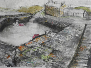
Today I kept the momentum going, building on my sketches of another Caithness harbour - Keiss Harbour. When we had arrived at Keiss last week it was a bit stinky - there was a seaweed problem - seaweed had been swept into the harbour with one of the recent big storms and was then trapped. The stink was from the decomposing seaweed. Another side effect of this was that the water was a sort of milky turquoise colour.

Well I did as much sketching as I could tolerate at the time and spoke to a couple of lovely fishermen (who were also struggling with the smell).

It all came back to me today when I looked at the sketches.
The other stunning thing about Keiss is the colour of the harbour walls - there's a lot of yellow in the walls (I assume it's a kind of lichen).  Because of these two colour references, I was straight into a different palette - turquoise and yellow - not a colour combo I have used much before. I started with a few lines in ink and some bright colours.
Then I added more detail about the stonework. The harbour was originally engineered by John Bremner and the stonework is both beautiful and robust and I did want to try and capture the essence of this.
But I thought this was still a bit too bright, so I then knocked the colours back a bit.
I tried another view too, trying to depict the inner and outer harbours together. Same colours.  I thought I had worked out quite a good composition (not entirely true to life).  Here was my start.
I'd included a couple of boats in this as well as the main building in profile. I was told that this building had been almost derelict a few years ago and it was offered for sale for £1. It's now been refurbished as holiday accommodation so it's great that it has a future. The harbour would be sadly diminished without it.
Again I was trying to add more detail about the stonework, but the colour was still a bit too bright, I thought.
I had toned down the sea, but actually I thought it looked a bit dull and smudgy. So I added some colour back in and had a go at the stone surfaces and the boats - attempting to get some interesting marks and detail in without drawing in each stone. I used ink, inktense and acrylic in various dilutions.
So that's as far as that one got.  I'm not sure - these look a bit cartoon-like. Is this what I wanted to convey?   However these are really studies, so again I've set them aside and will review later.
Planning more work tomorrow!  Maybe a different palette?


Tuesday 30 June 2015

A Fresh Start

It's been a while since I posted a blog, but now that I'm back from a week's holiday in Caithness and Sutherland I'm raring to go with creating some new work. My aim over the next month is to get some serious uninterrupted work done. I just need to paint paint paint!

I've made a start over the last couple of days - been reviewing my sketches and supplementing ideas by looking at photographs - and I feel that I've made a good start. I find it quite difficult getting back to painting after a bit of a break.

Yesterday I was roughing out some harbour compositions, based on Kiess and Sandside Harbours in Caithness, searching for an interesting composition.


Today (with some difficulty) I selected a couple of the Sandside compositions and had a go at doing these at a larger scale using ink, white acrylic paint and a little crayon. I got as far as this and decided to stop.  I was determined to get something down on paper.


Determined not to overwork these, I set them aside and decided to focus on a view which had caught my interest - the strand and the limekiln at Loch Eribol.  My starting point was a quick graphite sketch I did yesterday.

On a large piece of paper I re-drew the scene in black ink and graphite. I was really liking making the random ink marks on the beach. However, one can't be too precious at this stage of making a picture and so I continued.

Using a combination of two acrylic paint colours (plus white) plus inktense pencils, I got as far as this next stage. I was liking the way I did the sea - a lot less fussy than usual.  But when I reviewed the picture, I thought some of the marks on the beach were distorting perspective.

So I did a bit more and it ended up like this.
Not finished yet.  But all in all quite a good start, I think.
Back to the drawing board tomorrow.  Discipline!

Sunday 17 May 2015

A Spot of Reflection

It's harder than people think 'being an artist'. No, really! Self-doubt is a constant companion, made worse by the highs and lows of exhibiting and selling (or not selling!) work. But never mind the generalities, it's time I reflected on what I've done over the last month, what's working for me and what is not.

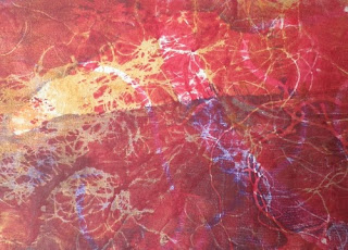
After the drawing episodes (see previous post), I had a spell of printmaking using a gelatine plate.  I was using bits of bracken and shreds of sacking to act as masks and create textured 'ghost' prints.

This felt like fun rather than work....
Then I tried cutting shapes out of textured material...
 Using thread and bits of lace as well as fish shapes...
And again, mixing shapes and textures...
Becoming more abstract...
And creating bolder abstract shapes....

 Out of all this experimentation I devised a set of basic rules to follow in order to achieve a pleasing result. I used these for a workshop I ran at The Schoolhouse Gallery in Dornie last weekend.  There's a randomness about the gel printmaking process, as I suppose there is about all monoprinting - or monotyping to be pedantic - and it certainly makes me think in more abstract terms about colour, texture and form....which is a jolly good thing.  I think there is a lot of potential for me to use this process to devlop the way I see and use coloured shapes and move away from realism towards abstraction. It keeps me focused on the aesthetics of putting together patterns of different colours that bears no relation to observational drawing.

However, I wanted to get some painting done this month too and I'm determined to work more in oils just to see what kind of results I can achieve. I started with a couple of ideas for lochan pictures, based on some sketches I did while out walking. Here's what I achieved the first session

And this

They look quite good at this scale, but I'm not at all sure about them. Need more work, I think but there is that risk of overworking. And they are a bit too realistic, not abstract enough.

But then I was really doing these to paint myself into another pic I had started a couple of months ago. Here it is...
I was quite pleased with this but thought it needed more work, and it had some elements that were a bit too realistic and the composition looked a little too contrived, too studied.  It is an attempt at an abstracted composition which I had worked out through drawing. My original little study, based on an observational sketch, was this (I've polished this up now and may get it framed - ha!).

What I liked about the scene was the orange island and the blue lochan and how they are opposites and kinda balance each other. However, the oil version wasn't quite working. So I went back to drawing and then back into paint - trying NOT to be realistic - and this is as far as it's got now.
Getting better, I think.  The composition has improved, but maybe the colour is too bright now. I did like the coldness of the earlier version. But that was done in a different season!

I know that I must keep focused on what am I trying to achieve. I'm not trying to create pretty pictures or cartoons: I'm trying to say something about what the landscape means to me: what it says to me - beauty, ruggedness, wildness; what I observe - quirkyness and delicacy; what I feel - preciousness, ephemerality. But there's no point in describing it in words...the challenge is to channel all of that into paint ... ha!


Wednesday 15 April 2015

More Experimental Drawing (2)


Still working from 'Expressive Drawing' (http://aimoneartservices.com/expressive-drawing-book-/view/378), the next next chapter in the book related to drawing textures.

The book pointed out that in drawing practice there is very little actual texture – you're not creating indentations in the surface of the paper, you're aiming to create the impression of texture, conjuring up an image of texture. Up until now I've always thought of texture as something that is descriptive – I observe what's in front of me and try to describe it through pencil, graphite and charcoal marks. What is new to me is the idea of metaphorical texture – arranging line and mark to describe the internal world of emotion/psyche/spirit. As the book says “It makes the invisible visible, the intangible tangible.”

As I worked through this, all sorts of bells started ringing in my head. Matisse and Klee both talk about delving below the surface into the invisible, of seeking to capture the emotion one feels about a subject rather than visible reality. Kandinsky advises that the artist must express what is peculiar to himself; his eyes should be directed to his own inner life and ears turned to the voice of 'internal necessity'. In his early abstract phase Diebenkorn would routinely reject and destroy paintings that owed too much to the visible world. I know my sketching tends to the 'observational' – I've always thought it is important to capture in a sketch what I see at the time. While this is clearly influenced by the mood I'm in at the time, I cannot pretend that my sketches are a full-blown emotional response to a subject.

So the idea of 'metaphorical texture' interests me greatly!

Let's unpick this a little. It seems to me that to create metaphorical texture one has to set down one's own idiosyncratic marks to describe how one feels about the essence of the subject one is drawing. Abstract artists like Klee created their own language of marks.  If we think that all subjects have hidden depths, we can also recognise that as we observe them we subconsciously bring our own experience into play – what we know or have learned about them, how we have experienced them at first hand, the extent to which we feel comfortable with them/feel unsettled by them/are anxious about them. And I suppose my aim should be to create a personal vocabulary to convey the hidden depths that I see.

Anyway, the exercises in the book were designed to get me thinking about different textures and drawing these.  Then I had to create textures that expressed different emotions. This was my attempt.
 Finally, I had to draw textures from observation without attempting to draw the reality of the objects. (I can see that this is a potential route to invisibility.)  I sat in the dining area with the table and the fire and drew this, a bit like a sampler.
I found it quite difficult, not drawing the objects.  From this last drawing I then had to compose a further drawing using only the textures I had captured.


I think this particular set of exercises sits at the heart of moving from realism to abstraction. I think I should return to it in the future.

In the meantime, to give my head a rest, I finished the day by drawing a Scots Pine that I could observe from my window. I've always been dissatisfied with my previous attempts to draw a Scots pine tree, but this time I tried to focus on the quality of the pine needles and the cloudy appearance of the foliage, thinking about the invisibility of the tree. I thought it turned out quite well and that it's a little different from my other sketches.  I thought I could detect some influence from my drawing session.  Maybe I'm beginning to let go from realism a little. What do you think?
 I will return to this again soon!

More Experimental Drawing (1)

Have had a bit of a break from painting - first there was the exhibition, then I was ill, followed by my London trip (and visit to the Diebenkorn), etc. Must be my longest break for a while. But I'm back into work mode now. Thought I'd try some more experimental 'expressive drawing' to get me up to speed. (I started this in early March - Blog Post 2nd March - based on the book 'Expressive Drawing' http://aimoneartservices.com/expressive-drawing-book-/view/378)

When I left off, I had just finished doing Line and Mark with this drawing - the aim was to create a 'conversation between expressive lines'. This was to be done spontaneously - no pre-planning at all - and I was seeking to have a dialogue between two or three linear 'characters'. It's quite hard doing these things at the time and very interesting to look back at the result now.
It's interesting to look at this drawing having been to the Diebenkorn exhib. I noticed that in his earlier abstract phase he used line a lot and I did like the effect. I did feel a strange sense of satisfaction after doing this drawing.

Now I had to start exploring 'shape'. What type of shape?
  • Geometric & organic
  • Static and directional
  • Simple & complex
  • Angular and curvilinear
  • and more
and then create 3 shape compositions using, first, one circle, one square and one equilateral triangle. Here are the results. Looks like I ended up exploring relationships between the shapes - from stand-off to touching and then overlapping - my logical mind at work, I think.


In the next exercise I had to use an oval, an elongated triangle and a rectangle. Here's how they turned out.


At this stage I'm not really composing the picture in a premeditated way, just being intuitive with these shapes and then looking at the differences between the two sets of drawings. I think the second set of drawings gives a greater sense of tension and movement than the first.

In the final drawing exercises relating to 'shape', I was asked first to mix angular and curvilinear shapes in a composition. Here's what I did.
And then I was asked to mix organic and geometric shapes in compositions.
Interesting results for me. I've never created any drawings like these before. It was challenging and exciting, almost liberating, and has definitely got me thinking about the role played by shapes in a drawing/painting. I feel as if I'm learning something here!  Letting go of realism, perhaps?