Saturday 22 December 2012

Lochcarron Days Again

Happy to be up in Lochcarron again, and getting some time for sketching and working on pictures.  I need to get a few more pictures ready for the join exhibition Rona and I are hosting in March.  But I'm not in a panic yet.

Lovely days on Monday and Tuesday this week and I managed to get some sketching done.  On Monday we walked up the hill above Achintee and arrived at a frozen lochan.  We remembered from a previous walk that you get a great view looking north from the lochan and it was warm enough to sketch (just!).
Frozen lochan sketch.
It was so bright that I didn't hesitate to do a colour sketch using chalk pastels.  I wanted particularly to try and capture the frozen-ness of the lochan - not easy (for me) to get the colour quite right.
On Tuesday we went down to Drumbuie for a coastal walk.  Again it was gloriously sunny, so I did some pastel sketches.


But now it's turned gloomy.  I'm back to snatching sketches in ink and charcoal, dodging the raindrops.  The good side of this is that I've been indoors, working up from these sketches and from photographs.
Drumbuie shoreline study
Drumbuie shoreline work in progress
With this Drumbuie study, I started off making a quick colour study from a photo using inktense pencils - I quite like them - and then I got the acrylics out.  I think I need to go back and study the vegetation on the foreshore to get a bit of detail.  But it's a start...it's allowing me to get back into more serious work.  What's also helping is that I'm reading Jack Flamm's book "Matisse on Art".  Although it makes me feel somewhat inadequate, it also inspires me.  So much to think about!

Monday 19 November 2012

Catching Up with Sketches

Had a few distractions of late, and have not been painting quite as much.  Was back in the studio today, trying to make a little sense of sketches I did last week, and doing a little tidying for the Open Studios event  (on 8/9 December).
I reviewed all my sketches and decided to have a go at this one.

Loch Torridon view - Initial sketch
I chose this sketch because I have decided that I like to try and capture the long distant views of the hills.  I find such pictures please me more.  Anyway, I made a start.
Loch Torridon view - emerging
Fairly loose at this stage - just graphite, allizarin, white and cream-coloured oilbar.  I needed some blue, I thought and orange - the colours of the hills were particularly orange last week.  Added ultramarine and indian yellow.  Oh, and water!

Loch Torridon view - emerging
Carried on in similar vein, thinking more about marks.

Loch Torridon view - emerging
This looks quite good, now I see it, nicely hazy in the distance, but I did go further.   I wanted to bring out the bridge which is a bit of a focal point.  So on I went....

Loch Torridon View - emerging
I stopped here, as light was fading.  Actually, I think this photo makes the picture look better than it actually is.  At this stage I'd like to add a little ink, I think, and knock back the distant hills, but I've left it in the studio so won't see it again until Friday.  A start perhaps.

Monday 22 October 2012

Inspired by North Berwick

Yesterday was so gorgeous - a most beautiful autumn day - had a lovely walk at North Berwick.  By pure coincidence, I had started a picture in the studio based on a sketch done in an autumn/winter day last year, but I wasn't happy with it.  When I went into the studio today, my head was full of the seaside colours.

I had been doing a picture of the Bass Rock and related islands.  It had started off almost water-colour-like, looking like this....

 I was trying to hold on to that delicacy of colour - the mistyness around the islands.  I was also worrying about the sea colour.  So working carefully the next stage was this.....

 I had then taken it a little further - adding more acrylic colours, working from my colour sketches.  However, I was greeted by this today - wasn't happy!


This just looked so lumpy and dead.  So I realised that I must not be so precious about the delicacy of colour nor so literal - no need to slavishly copy what was in my sketch book.  I did a wee sketch suggesting a different foreground - using sketches I did yesterday on the beach at North Berwick - and then I went in with two tones of white acrylic followed by more graphite to get this.

I felt this was going in the right direction.  I remembered the pale barnacle-covered rocks and thought I would put them in the foreground.  And also tried to re-capture some colour in the islands - my original sketches had included ultramarine, crimson and green.  And I tried to loosen up on the treatment of the sea.  So finally it ended like this.
Misty view from North Berwick beach.
I was quite pleased with this at the time, but later on I wasn't sure.  After I'd finished, I also realised that there has maybe been a subconscious Peploe influence - looking at his beautiful paintings on Saturday at the Scottish Gallery.  Perhaps that has stayed in my head too.

Monday 15 October 2012

Slumbay Dreams.....

Have been in the studio a bit, working but not being hugely productive, I feel.  I thought I'd go back to doing black and white pictures and embarked on a picture of Slumbay - approximating to the view looking west from the front at Lochcarron.  I have so many sketches of this, it seemed like an obvious picture to try.

As usual, I started in charcoal and then rubbed out a bit.  So it was looking like this initially.

Slumbay with Boats - a start
Then I went over this with ink (mostly black but also some blue) and some oil crayon, oilbar, then some white acrylic.  So it looked a bit more dramatic.

Slumbay with Boats - emerging
But I wasn't sure about the composition, so I decided to crop the picture a little, and carry on with a bit more ink.  I was reasonably pleased with the result....
Slumbay with Boats
However, I had also started another version.  This was on sligtly more robust paper, and I kept the composition cropped - a square version, and this time I started in graphite rather than charcoal, and then added ink etc.  It seems to have a dreamier feel to it which, on reflection, I prefer.
Slumbay with Boats 2 - emerging

To be honest, I wasn't sure whether to finish this or not, having 'finished' the first one, but I carried on anyway.  It needed more work on the foreground and a bt of tidying up.  So I carried on with ink, graphite and conte, and a little acrylic.  It ended up pretty much like this.
Slumbay with Boats 2
It's probably a case of spot the difference.  Which is the better one?  Probably the second one, which goes to show that it's always worth working away at a theme or a motif. 

I may even do it again!  But I suppose there's no guarantee another version would please me any better.

Monday 1 October 2012

Every Picture Tells a Story

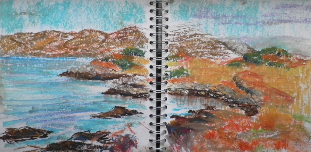
In the studio today - had missed a few days.  Last Friday I tried to go out sketching - faint hope! Beaten back by some ferocious rain showers.  So it was back in the studio today, working on the thumbnails again.  I decided to focus on a picture of a tree, a boat and the shore.

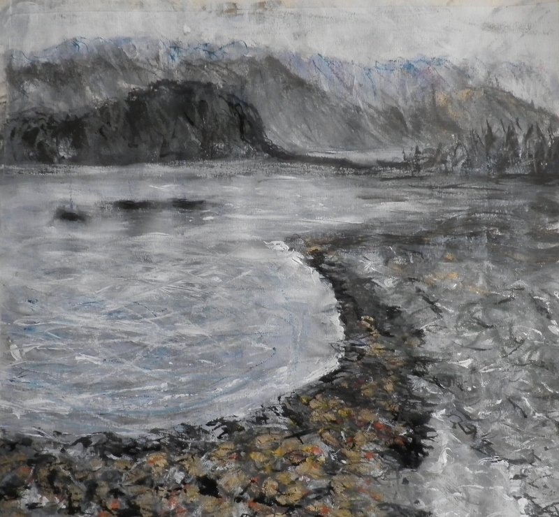
Now the last time I was in, I had worked up a picture mostly in black and white.  I started with this.
 I realise now looking at the photos again that when I started out on this theme I had given quite a bit of thought to composition, and abstract values.  I forgot about this when I was in the studio - I can see it now!

Anyway, after making that start, I progressed through these steps.

So this is how it looked this morning.  What I thought I'd do was to start a coloured version and do a dark sky and sea.  So I pulled out a piece of paper which already had some colour on it, and I made a fresh start, forgetting all about my abstract values (of course).
I paused after this start cos' I found the sketchyness with the bold colours really interesting.  Maybe I shouldn't do exactly what I had planned.  So I tried carefully adding some blue (mixture of ultramarine and quindacrone blue.  I was thinking about layering up carefully.
This is still pretty sketchy and I did like that quality about it, but on I wanted to continue with darkening the sky and the sea.
Finally I added some green and sorted the sky out.

Now, as usual, there are some things I like about this, and some things that could be better.  I like the little cloud, and I like the colour of the far away hill.  Does the green island/promontory work?  I'm not sure - maybe it's confusing.  I like to boat colour and the shadow, but I wonder if the boat is too big in relation to the tree.  And above all, what has happened to my abstract values?  Doh!

But I'm going to be positive.  I think this is a good start to some 'picture-making', which I've decided is to be my theme for the autumn.  I want to get away from just re-painting sketches.  I want to make pictures, and pictures have to tell a bit of a story.  I think there IS a little story in this picture, so that's why I think I'm going along the right lines......just not there yet.....

Tuesday 18 September 2012

Working hard...

In the studio again yesterday, trying to keep focused on my landscapes. I tried the Slumbay seaweed picture again first and spent all morning on it. I was working hard on the colour, trying to get a more accurate representation of the navyblue sea.
Emerging picture Seaweed Bay
I think this is better for colour than last week's version, but I'm not so sure about the composition now.  I've brought it home to think about it.  The far away shore may be on too big a scale, and maybe the sea is too wide.  Ah well, we'll see.

In the afternoon, I thought I'd then return to my black and white theme and tried these.
Slumbay with Boats sketch
I wasn't pleased about how this turned out, but when I crop it, it looks more interesting.
Slumbay with Boats Sketch
Much better, isn't it?  But technically it's a bit of a mess, so I think I'll re-do it.
The other one I tried was a scene based on a Camusteil sketch.
The Front, Camusteil Sketch
A bit of artistic licence here (that ruined cottage is not ruined).  I'm so surprised at how this looks at this scale. So maybe I'll have to keep at this one too.  I may try it on a smaller scale.

I came home exhausted from the studio, but I've cheered myself up now.  I think I've got a focus for Friday - that's the main thing for me. Just need to keep some drawing going until then.....

Monday 10 September 2012

In the Studio

I was glad to get into the studio today after a bit of a break.  There have been too many other things going on of late...so it was good to have a chance to work on some new pictures.

I decided to focus mainly on the seaweed sketch from last week and have a go at developing this.  I felt it had abstract qualities that I wanted to develop.  So I started with the sketch.
Sketch from Slumbay looking north
It's interesting to look at this again.  The foreground marks were carefully considered - I think it was a sort of stonecrop growing through the pebbles.  And I quite liked the trees on the hills.

So I started in charcoal and some rubbings out, then added some golden oilbar for the seaweed etc. I then added a bit of acrylic colour.  I was trying to limit the palette to blue at first with some black ink, focusing on getting the sea colour right - that lovely navy blue which is such a great contrast with the orange seaweed.  I thought the blue had a hint of violet in it, but not too much.

Emerging picture - Shore with seaweed, Slumbay


In the end, I added a mixture of black and blue inks to try and achieve that dark sea colour.  I also realised that there was really no getting away from adding some green.  So I mixed the cobalt with lemon and ochre to try and get something naturalistic looking.  Then I brightened up the seaweed with a mixture of Indian Yellow, Lemon Yellow and Yellow Ochre.  The result is fairly dramatic. 

Shore with Seaweed, Slumbay


Looking at it now, however, I think I could improve on the shoreline marks to give a better feel for the stonecrop (or whatever it is).  And the foreground is not quite the right green.  But the marks are quite loose, and I'm happy with that.  A good start, perhaps.  But I want to paint it again!

Sunday 9 September 2012

Revived by Lochcarron

Just had a good week in Lochcarron.  Sadly the weather was not as good as it's been all summer up there, and we had to battle through the rain for a walk up above Attadale.  But the sun came out enough to allow me opportunities for some worthwhile sketching.

Down on the shore at Slumbay, I did this pastel sketch. I spent a while trying to capture the light on the hills, and also working on the foreground - that jumble of shoreline plants.
Sketch looking west from Slumbay
I find that working in pastel makes me think about the colour more (not surprisingly) and usually makes it easier to tackle a painting back in the studio.  The light was changing a lot - dark clouds and showers coming over - giving that colour drama between the navy blue sea and the bright yellow seaweed.  That's what I was trying to capture in this sketch.
Sketch looking north from Slumbay
Again with this I was focusing on the foreground - so much colour from the plants growing through the pebbly shore.  I think the seaweed is less successful in this sketch - I need to think more carefully about the marks. I did one other sketch from Slumbay, this time in charcoal.  This might work better as two separate pictures - a diptych perhas?
Sketch looking east from Slumbay
Another favourite spot is North Strome - quiet again now that the road between Strathcarron and Kyle is open and there is no need for the ferry any more.  I did this charcoal sketch - it was a bit windy to stop too long.
Sketch looking west from North Strome
I was sitting on a rock and wanted to ensure the rock appeared in the sketch too.  Plockton is in the distance, and even further away are the hills of Skye.  It's a great view.  Wild and inviting.

We had a day on Applecross too, and the sun came out.  Went down to Camusteil where it was so warm.  Tried to capture that lazy sleepy feeling.
Camusteil Jetty
Again that lovely bright seaweed at this time of year. The other great colour in abundance was from the rowan trees.  There's an amazing crop of rowan berries this year - that means there's a hard winter coming, I think. Difficult to draw, rowan trees, especially when the midges are biting, but I had a go round at Fearnbeg.  Pastel again.
Fearnbeg Inlet
Shame about the midges as Fearnbeg is a lovely spot.  It's got good atmosphere too.

Really glad to get these and other sketches done - hopefully it will kickstart a bit of activity for me back in the studio.  But sadly that means that I'm back in Musselburgh where I shall pine for the hills and the wild countryside.


Monday 6 August 2012

Sketch development

I was continuing with developing the sketches I did on Jenny Martin's course.  In the sketchbook, I had done this little quick pencil sketch when I was at Newhaven - almost a thumbnail.  Here it is.


Jenny had encouraged us to take photocopies and change the scale.  In doing this, I thought it might look a bit more interesting with larger figures in the foreground.  I therefore increased the scale of the figures to make a different picture.  This of course meant I had to change the scale of the lighthouse for the picture to make visual sense.  So it ended up like this.


Back in my studio, I decided to have a go at painting the scene with the larger figures, but I was not certain about putting figures into a picture like this.  What do the figures signify?  Surely there should be some deeper meaning or symbolism to figures to make the picture interesting?  I thought then I would put one figure and a ghostly figure, and so it ended up looking like this.

Looking out to sea

I don't think I like the ghostly figure so I'll probably paint it out.  But the juxtaposition of the lighthouse and the church kinda works.  This is in oil pastel mostly, with some pencil and a little acrylic.

I did another version of this Newhaven view...without figures.  However I was trying to do something clever with the lighthouse.  So that ended up first of all looking like this.


Now, I didn't think this worked at all, and so I tidied up the lighthouse.  I also managed to shrink it significantly and so now the scene no longer looks like Newhaven. 
Lighthouse and Church
I quite like the palette as it is so gloomy, and the pink in the sky chimes with the pink granite of the lighthouse base (which actually is realistic).  Lighthouse still needs fixed (it's a bit skew-whiff), but maybe it works as a picture despite the lighthouse being miniaturised.  This one is in oil pastel, acrylic and pencil - bit of a mixture.  Will see how it looks when I'm next in to the studio.

Wednesday 1 August 2012

Sorry not to have updated this with the end result of the course.  I worked a few ideas up in the sketchbook.  I was trying to bring a few ideas together - not something I've really done before - and I thought I ought to try this.   I ended up doing this little picture which brought together my figure on the museum balcony with the Newhaven lighthouse.  There may be something here I could develop, but I haven't yet done so.
Lighthouse Woman Study.
The other image I worked on was the skiff.  I did a very big picture of this which started out looking like this.
Newhaven Skiff (big emerging picture)
This was really underpainting, so when I took it further, I did tone it down somewhat.
Newhaven Skiff (big picture)
But in taking it further I lost all the energy of the marks.  It looks a bit boring.  I wasn't all that happy with it
Not to be put off by this, I tried another version in the studio this week.  It ended up looking like this.
Newhaven Skiff (small version)
I think this looks more interesting.  I'm quite pleased with the edge of the pier (I did focus a bit of attention on this).  Maybe the boat needs a bit more colour before I set it aside.  But it does have a dreamyness about it.

Ah well...what next?  More sketching perhaps.  And there's a trip coming up a week on Friday at Crammond, so that means more boats...!