Showing posts with label Printmaking. Show all posts

Monday, 9 January 2023

Starting On A High

Happy New Year! I was glad to get through to the end of 2022, and happy to welcome in a new year with hopes for the future despite the obvious ongoing global concerns. Once again, I aim to do more regular blogging this year, so we'll see how that goes.  (My record is not great!)

I'm starting the New Year on a high because I have two pictures on show in the RSA building at the moment. The curators of the current SSA exhibition (130 years) selected a painting and a print of mine - they are modest pictures but I'm delighted to be part of the amazing show. Today I thought I'd tell you the stories behind the paintings.

“Iona Rocks” is an oil painting. It's based on a sketch I did on the north beach, Iona when Peter and I visited in September 2021. It was a magical day. We left Tobermory at 6 and drove down to get the first ferry over to Iona, and headed straight for the north beach. The sun was just burning off the morning haze when we reached the beach and I did several sketches. Inevitably I was thinking about Peploe, Caddell and the other Scottish Colourists as we walked. When I came upon this particular group of rocks, there was something that appealed to me and I sat down and did a more detailed coloured sketch in pastels.


This was the sketch that I returned to in the studio to create this painting.  I did feel quite transported away back to Iona  and the world of the Colourists while I was painting it.  It turned out a bit moodier than the sketch, but the colour is much richer.  I was quite pleased with it at the time.  Iona is such a magical place - I did a few paintings from those sketches.


“The Black Pool” is a picture based on a landscape closer to home. It is a photopolymer print, based on several sketches I've done on a number of trips to Silverbridge and the Black Water, just north of Garve (between Inverness and Ullapool). I was alerted to this unassumingly beautiful place by the artist Jonathan Shearer who extolled its virtues as a place to go and sketch and paint en plein air. I was not disappointed! I've now been there several times, attempting to capture something of the character and atmosphere of the river and riverbanks. 


I have a number of sketches and I had a go at painting this particular scene. I did an earlier blog about this which you may remember.


Then, when I was looking around for drawings to use for making new plates, I decided to draw it in ink and use this same sketch to make a photopolymer plate.  When I printed it out, here's how it looks.


It's interesting to compare the pieces and I feel very fortunate to be exhibiting with the SSA.

I want to keep the momentum going.  I'm now sorting out my thoughts for a year of hard work...a few exhibitions on the horizon. So I hope to blog again soon.

Sunday, 23 January 2022

Watery Thinking

Last month I wrote that I thought I would start to explore a Biosphere-related theme. I'm happy to report that I've managed to develop this a little further.  I haven't been confining my work exclusively to biosphere-related ideas, but I'm trying to stick with it.  

I haven't been back to Garve, to my favourite black river, but I've looked back at my sketches and thought about progressing with the work.  And I've done further sketching in woodland.  However,  I first thought I'd try something out in oils....

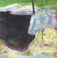
Black River - Small Oil WIP

This is a very small oil pic, a study, really.  I'm not sure about this composition and if I was going to do a larger pic I think I'd need to go back and do a series of sketches.  There are some things I like about this, so I think I'll park it and resolve to return to Silverbridge.  

As a trip to Edinburgh is looming, I decided to focus on a different sketch of the river and redraw this on film in preparation for making a new photopolymer plate at Edinburgh Printmakers. The one I thought might make a good print is this one looking across the river.  Here's the final drawing I made on film. I think (hope!) it's got potential....

Black River With Trees

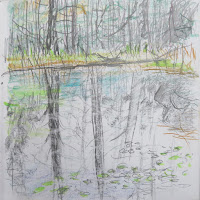
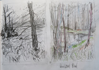
On Monday this week, I returned to my favourite woodland lochan at Achnashellach for more sketching. Of course, this year's mild weather means that there's no snow and ice, so no frozen lochan - I find the lochan's watery surface much more difficult to handle than an icy surface. The interplay between viewing the reflection on the top surface and seeing into the murky depths – it's hard to capture that.  I suppose that's what intrigued Monet about his waterlilies and ponds. Anyway, in this week's sketches I struggled to capture such visual effects, as you can see....


Sketch 1


Sketch 2
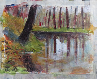
 Sketching was difficult enough, but what about turning these sketches into finished work? Well, all I can say is that I've made a start with this acrylic study - but there's a long way to go. 


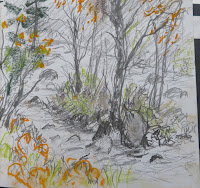
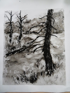
Because I'm heading into Printmakers next week, I was thinking about other Biosphere-related images that I could use as the basis for making a new plate. This took me back to earlier sketches I had done of the river at Achnashellach.

Sketch 3
 

Sketch 4


I did several re-drawings from these and other sketches.....here are a couple of them.

And here's the final drawing on film, ready for making the new plate.

Dark Tree By The River

So this month there's a lot of work in progress and a few unresolved questions.  Will I be able to turn these new finished drawings into new plates? Will they print out well? Can I master the challenge of painting the lochan to show the dreamy interaction between reflected and refracted light? I suppose that's my challenge for next month...


Wednesday, 15 January 2020

More Printmaking Experiments

Happy New Year!
I'm having a happy time in the studio trying out various different things.  I've been having great fun making chine colle prints - adding bits of Japanese paper onto prints to give them extra colour or texture.

I started with this one. I felt a little tentative about adding the chine colle and I was teaching myself as I went along, so with this first one I used Japanese paper with wavy lines in order to give the sea a bit more interest. It's a bit tricky as you have to add glue to the paper and then place it on top of the printing plate glue side up so that the paper sticks to the printing paper.  As this result ended up not too messy, I was quite pleased with this as a start and thought I'd continue.
My next effort was to add some colour.  This time I was using an aquatinted copper plate which I had cut off a larger plate I hadn't been happy with.  I had burnished it then re-aquatinted - I was trying to salvage something from this!  'I must be subtle' I thought to myself, so selected some cream-coloured tissue which I hoped would improve the look of the sky, and offset this with a cream-coloured paper with coloured fibres in the foreground. 
Making these prints was stimulating me to think about blocks of colour in the landscape, and also accentuating how light might fall. At this stage I was still trying to be subtle. So here was the next effort with another new photopolymer plate.
But then I got bolder and I thought I might try more of a landscape colour, using the same plate. It's really interesting to compare and contrast the two results, isn't it?
I then thought I'd try colour on another small plate. I wanted to use an orange-coloured paper as the image on the plate was based on an autumnal view in the Gruinard area (near Poolewe).

The first colour shape looked a bit too contrived. So I had a second go with a simpler geometric shape, then with my third go, I finally settled on a simple triangle.


I think this simpler shape has the effect of making the image look more abstract. So now I'm thinking about how to create new images where I might add chine colle colour shapes like this.

The great thing about doing this is that there's always an element of surprise when you pull each new print!

Monday, 23 December 2019

Last Blog Of The Decade

What a poor year it's been for blogging.  I'm afraid I have fallen short of my aspirations.  Instagram is much quicker and easier to do and I think I've been distracted.  However, I can't let the year draw to a close without one last effort.

It's been a busy year and I've filled many sketchbooks.  Observational sketches of trees and landscapes. But every interruption means that I lose my train of thought - and so I end up going off down various avenues - heathlands, hills, seascapes, woodland.


I think my main inspiration this year has been Victoria Crowe.  Having seen her work at both the Scottish Gallery and the City Art Centre in Edinburgh in the late summer it has come home to me just how much hard work one must do to produce any meaningful work.  There really is no shortcut - as she says, there are no easy solutions or quick hits. There is only hard work, overcoming difficulties, and things that emerge from the process, the process of making art.  I realise that I should try to be more 'process-driven'.  It's that stage from sketchbook to finished work that is so important.

I thought I might focus on woodland or gardens for a bit, (a theme from the start of the year) and set about some work after an autumnal visit to Attadale Gardens.  I enjoyed loosening up the colour and thinking about bringing a figure into the picture. I came up with these two paintings which I quite liked. 


However, this avenue of thought was interrupted by a trip up to Poolewe - more sketching of amazing landscapes and beautiful colours. The Autumn colours were particularly lovely this year.


And then another trip to Edinburgh was looming and I was keen to prepare some new printing plates at Edinburgh Printmakers, so I had to set to work on some finished drawings on film, ready for exposure.

 I've been thinking too about how to add some colour to my prints to make them more interesting.  I have a few colours of etching ink, and I can print plates with more than one colour, but it doesn't always turn out well.  Also, thinking about Victoria Crowe's approach, she often brings in a wash of colour as a compositional device. I liked the idea of chine colle as a way of introducing compositional colour, so I read up on the technique, sent away for some Japanese papers and I've now had a go at it with some of these new printing plates. This was my first attempt using a paper with wavy line patterns  - I thought it was kind of interesting.
And then I tried a copper plate - experimenting with different colours and different arrangements.


It makes the printing process even more exciting - you never quite know how it will turn out! You have to take time to think it through before you make the print. It's certainly something I plan to try further - I have lots of ideas and I'm thinking about subtlety and boldness and what works best.  Or maybe there is no best....just different.

So as usual, there is much to consider....

Saturday, 24 February 2018

Winter Lingers On

January/February is the time of year which gives me the best opportunity to get on with new work. The village is quiet, the Gallery has been closed and the New Year surge is still fresh. Lots of time and motivation to get on with work you would think.

Well, there are always distractions, and, as I mentioned in January, the snow has been a huge distraction, or then again, perhaps it's been an inspiration! The transformation of the landscape with a blanket of white, the change to the light. And the roads have been a bit icy so it's been difficult to get out and about for new sketches.

More Snow pictures

I've been continuing to try to capture the joy of the snow – I do love it! And because it's come and gone and come again this year, the snow patterns have changed. One day I was preoccupied by the 'iron filings' patterns on the hills, the next I was transfixed by the shroud of ice on the shore, and another day it was the sweeping snow showers. I've also been trying to come up with a satisfactory painting of Meal Cean Dearg, one of the Strathcarron/Torridon Munros.  I got as far as producing these two, but not satisfied with either.


However the snow inspired me to make a new linocut plate too. 
I made a sketch of the kale in the garden of Seabank Cottage in Lochcarron - here's a photo 


I could see that there were the makings of a good black and white picture - loved the black patterns of the kale leaves.  So I've made this linocut and have called it 'Winter Garden'.
'Winter Garden'

  Trip to Inverewe

Despite the ice and snow I managed a trip to Inverewe Gardens in January. A number of artists met up – there was a residency on – and we managed a walk and a couple of sketches in a weather window, until the sleet started. I loved the bleakness of dead plants in the snow and managed to do a few sketches such as this one of dormant Gunnera. I was intrigued by the black shapes against the snow, but I haven't thought through where to go with this idea.

However, I'm starting to think that gardens might be a good focus for me this year. I find plant forms (and trees) interesting and I think I would like the challenge of a slightly different focus this year.

Making New Prints

Just last week I was down in Edinburgh for a few days and managed to get a couple of sessions in Edinburgh Printmakers. I was making a couple of new photopolymer plates, like this one that a re-working of an older print.  It's known as 'photopolymer gravure' as I make the drawing first on a piece of transparent film.  Here is the drawing on film and the Toyobo plate I produced.
 And here is a finished print I made this week.  I think if anything it's more expressive that the drawing, so I am pleased with it in that respect.
 I was also trying to improve an aquatinted plate that I wasn't happy with.  I realised that the composition was not good enough and so I cut the plate and did a further series of aquatinting to bring out the landscape, and here's how the finished print looks.
 It's based on a view of a lochan in the hills above Achintee, on the south side of Loch Carron.

They were good sessions – I think the new plates are OK. Now I just have to get down to printing out editions...on my printing press up here. But at least I have made a start.

Painting vs Printmaking

I find it difficult at times to switch from painting to printmaking. I think you must use different bits of your brain. With printmaking you have to be so clear about what you're trying to achieve – plan it out properly in advance – whereas painting is more of an exploratory activity. Matisse said something along the lines of drawing is of the mind but colour is of the senses and I suppose this explains the difference. Anyway, I feel as if I'm in a drawing and printmaking zone at the moment, so that's my focus for the coming month...I think...

Wednesday, 27 September 2017

Venetian Reflections

The thing about being away with a group of artists is that there's all sorts of talk about "making something" out of our sketches.  Let's have an exhibition!  The GOOD thing about this is that it keeps focus and momentum going.  Although I'm writing this now, in September - in the run up to our Viva Venezia exhibition - at the time when we got back from Italy, there was no realistic prospect of an exhibition.

But the talk alone was enough to keep me focused. I knew I had to get on with things as I was moving house in July.  I also wanted to work while images and thoughts were fresh in my mind.

In reviewing my sketches (previous blog) I realised that I had homed in to detail a lot.  The beauty of the buildings, the craft of the metal railings, the plasterwork and brick patterns - these details had attracted my attention.  Also the beauty of the decaying buildings, with stucco giving way to old brick, crumbling steps, rotting wooden doorways, the spread of green mould - I loved these colours.  And the typography of street names and house numbers, repeating motifs in plasterwork and in brickwork - I was fascinated by these.  They are all part of the richness of the Venetian cityscape.  I decided that Venice is a city that has become a landscape.

There are so many artists who have made images of Venice that it's hard not to have these images in your head when you go to paint.  There are very few of us who have not fallen in love with the work of artists of the past like Turner, and contemporary watercolour artists such as Angus McEwan - masters of their craft. So the first hurdle to overcome was to try not to think about these.

And sometimes we think too much.  Best really to get on and put things down on paper.  So this one was a start.  I was striving for the Venetian colour palette - a certain shade of red alongside Canal green.


As was this
And this

I was trying to do 'experiments' to see what would emerge - not trying to complete a painting.  I was also thinking about printmaking and what might make a good image for a photopolymer print.  This next motif had been the subject of one of my first sketches on our first day, so I re-drew it in charcoal and pencil.
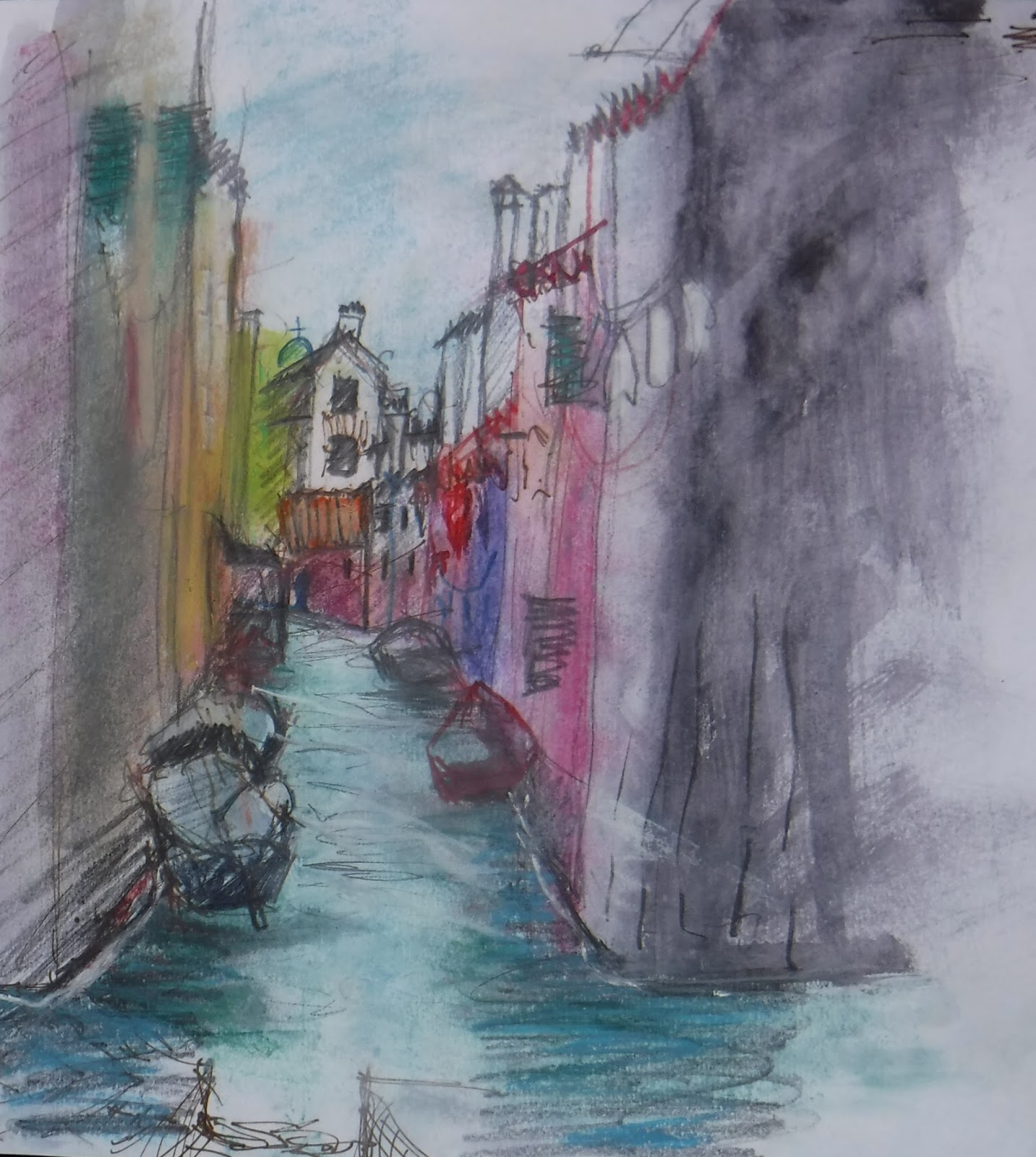
Maybe the composition was too busy, so when I redrew it in ink ready to make a plate, I rationalised the composition to focus on the canal and the boats.  Something lost and something gained....
I was trying to get a certain dreaminess into the image - taking that canal wateriness as far as I could - but incorporating a few of the details (doors and windows) I had observed too.
The other print I did was also a bit dreamy, but on reflection, perhaps less obviously Venice.
But then, I was not really aiming to be anything that shouted 'Venice' - I was, I suppose, searching for 'Venice beneath the surface' - the older Venice, the timeless Venice, the real Venice ?

I did a bit of reading around the history of Venice to understand more about its development. I read that in early years it had been a successful city state with a benign form of government that recognised the value of its workers and rewarded them accordingly.  Because of its defensive position in the lagoon, it retained a separateness and independence from the rest of Italy as well as being an important and wealthy trading place.  Later it expanded primarily as a place of entertainment, a playground.  That 'film-set' appearance is part and parcel of the 'real' Venice.  I also read articles in the press about the fragility of Venice, how threatened it is by damage caused by cruise ships and how this could be better managed but only if adjacent municipalities would work together. Also another threat emanating from the popularity of Air BandB which is driving full-time residents out of Venice.

So beauty and fragility continue to be two key aspects of Venice.  I rationalised that the canals are the source of the main threat - not just from cruise ships but also from Climate Change - and the beauty lies in the craftmanship and detailing and the organic nature of the city.


These thoughts led me to focus on doorways and watergates.  Rather a roundabout way to get there, perhaps.  But what followed on from this was a realisation that I couldn't do my usual free and easy acrylics, but that I'd need to take a little care over details such as fanlight and window grills in order to convey that beauty.  Hence I decided to use watercolour and ink.

I wanted to do really small paintings - like this study - smaller than A5.....


...but I needed a bit more room to recreate enough of the important detailing.  My pics have ended up roughly A4 in size.  Here's a composite with a selection. I'm not sure if I've achieved what I set out to do.  I would like to continue to develop this work and perhaps even go back for more sketching...time will tell.

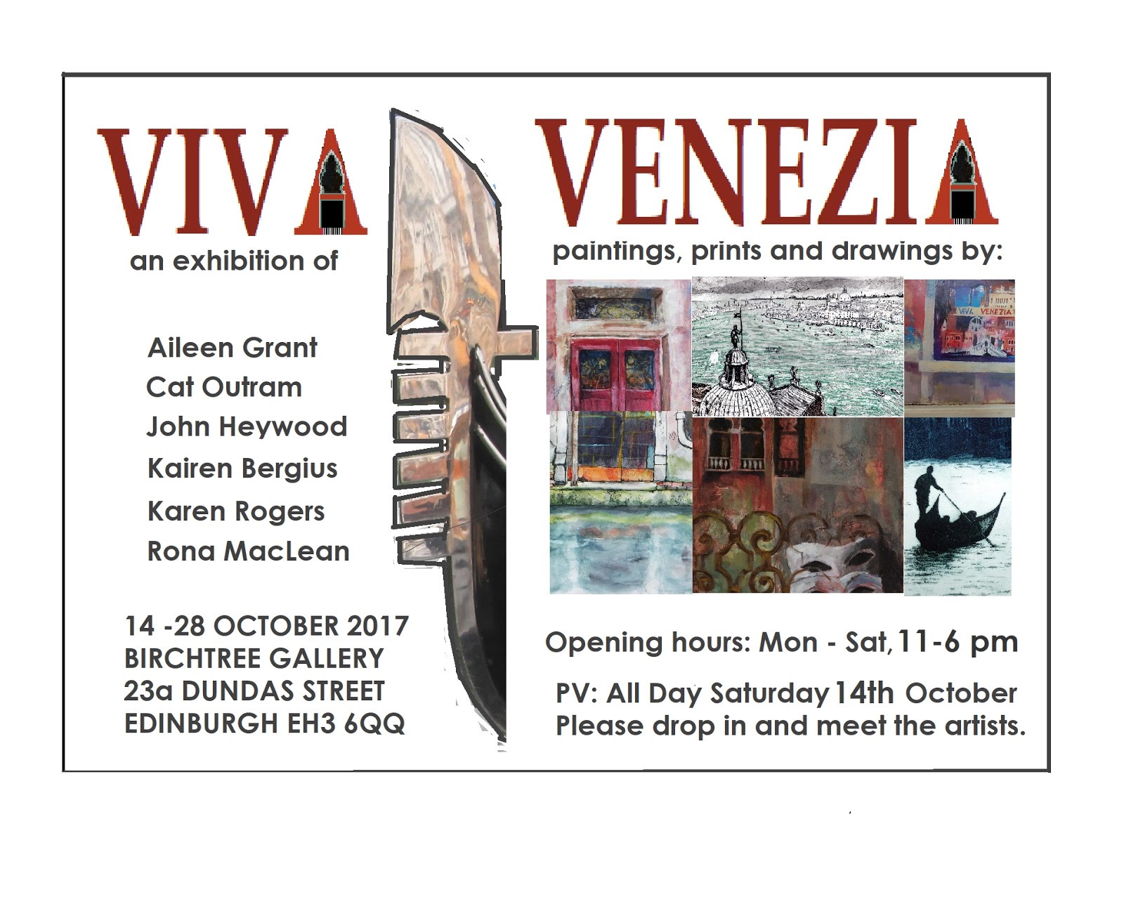
And now for the advert...our exhibition is
Viva Venezia
in the Birch Tree Gallery, 23a Dundas Street, Edinburgh
14th to 29th October 2017.  Here are the details

Hope to see you there.  :-)