Sunday, 9 September 2012

Revived by Lochcarron

Just had a good week in Lochcarron.  Sadly the weather was not as good as it's been all summer up there, and we had to battle through the rain for a walk up above Attadale.  But the sun came out enough to allow me opportunities for some worthwhile sketching.

Down on the shore at Slumbay, I did this pastel sketch. I spent a while trying to capture the light on the hills, and also working on the foreground - that jumble of shoreline plants.
Sketch looking west from Slumbay
I find that working in pastel makes me think about the colour more (not surprisingly) and usually makes it easier to tackle a painting back in the studio.  The light was changing a lot - dark clouds and showers coming over - giving that colour drama between the navy blue sea and the bright yellow seaweed.  That's what I was trying to capture in this sketch.
Sketch looking north from Slumbay
Again with this I was focusing on the foreground - so much colour from the plants growing through the pebbly shore.  I think the seaweed is less successful in this sketch - I need to think more carefully about the marks. I did one other sketch from Slumbay, this time in charcoal.  This might work better as two separate pictures - a diptych perhas?
Sketch looking east from Slumbay
Another favourite spot is North Strome - quiet again now that the road between Strathcarron and Kyle is open and there is no need for the ferry any more.  I did this charcoal sketch - it was a bit windy to stop too long.
Sketch looking west from North Strome
I was sitting on a rock and wanted to ensure the rock appeared in the sketch too.  Plockton is in the distance, and even further away are the hills of Skye.  It's a great view.  Wild and inviting.

We had a day on Applecross too, and the sun came out.  Went down to Camusteil where it was so warm.  Tried to capture that lazy sleepy feeling.
Camusteil Jetty
Again that lovely bright seaweed at this time of year. The other great colour in abundance was from the rowan trees.  There's an amazing crop of rowan berries this year - that means there's a hard winter coming, I think. Difficult to draw, rowan trees, especially when the midges are biting, but I had a go round at Fearnbeg.  Pastel again.
Fearnbeg Inlet
Shame about the midges as Fearnbeg is a lovely spot.  It's got good atmosphere too.

Really glad to get these and other sketches done - hopefully it will kickstart a bit of activity for me back in the studio.  But sadly that means that I'm back in Musselburgh where I shall pine for the hills and the wild countryside.


Monday, 6 August 2012

Sketch development

I was continuing with developing the sketches I did on Jenny Martin's course.  In the sketchbook, I had done this little quick pencil sketch when I was at Newhaven - almost a thumbnail.  Here it is.


Jenny had encouraged us to take photocopies and change the scale.  In doing this, I thought it might look a bit more interesting with larger figures in the foreground.  I therefore increased the scale of the figures to make a different picture.  This of course meant I had to change the scale of the lighthouse for the picture to make visual sense.  So it ended up like this.


Back in my studio, I decided to have a go at painting the scene with the larger figures, but I was not certain about putting figures into a picture like this.  What do the figures signify?  Surely there should be some deeper meaning or symbolism to figures to make the picture interesting?  I thought then I would put one figure and a ghostly figure, and so it ended up looking like this.

Looking out to sea

I don't think I like the ghostly figure so I'll probably paint it out.  But the juxtaposition of the lighthouse and the church kinda works.  This is in oil pastel mostly, with some pencil and a little acrylic.

I did another version of this Newhaven view...without figures.  However I was trying to do something clever with the lighthouse.  So that ended up first of all looking like this.


Now, I didn't think this worked at all, and so I tidied up the lighthouse.  I also managed to shrink it significantly and so now the scene no longer looks like Newhaven. 
Lighthouse and Church
I quite like the palette as it is so gloomy, and the pink in the sky chimes with the pink granite of the lighthouse base (which actually is realistic).  Lighthouse still needs fixed (it's a bit skew-whiff), but maybe it works as a picture despite the lighthouse being miniaturised.  This one is in oil pastel, acrylic and pencil - bit of a mixture.  Will see how it looks when I'm next in to the studio.

Wednesday, 1 August 2012

Sorry not to have updated this with the end result of the course.  I worked a few ideas up in the sketchbook.  I was trying to bring a few ideas together - not something I've really done before - and I thought I ought to try this.   I ended up doing this little picture which brought together my figure on the museum balcony with the Newhaven lighthouse.  There may be something here I could develop, but I haven't yet done so.
Lighthouse Woman Study.
The other image I worked on was the skiff.  I did a very big picture of this which started out looking like this.
Newhaven Skiff (big emerging picture)
This was really underpainting, so when I took it further, I did tone it down somewhat.
Newhaven Skiff (big picture)
But in taking it further I lost all the energy of the marks.  It looks a bit boring.  I wasn't all that happy with it
Not to be put off by this, I tried another version in the studio this week.  It ended up looking like this.
Newhaven Skiff (small version)
I think this looks more interesting.  I'm quite pleased with the edge of the pier (I did focus a bit of attention on this).  Maybe the boat needs a bit more colour before I set it aside.  But it does have a dreamyness about it.

Ah well...what next?  More sketching perhaps.  And there's a trip coming up a week on Friday at Crammond, so that means more boats...!

Wednesday, 25 July 2012

A week of sketching

Midway through doing a week's summer school at Leith School of Art.  Doing a course with the artist Jenny Martin, focusing on sketchbooks and the connection between sketches and finished pictures.  It's been interesting so far.  We've been to the Museum and to Newhaven Harbour, and we were privileged to view a few sketchbooks of Scottish Artists of yesteryear - Crozier, MacTaggart, Mackintosh Patrick, and Eardley - demonstrating how well they could draw!

Our efforts on this course have been done on coloured and collaged pages, which we have prepared, as well as white, and in a variety of media - oil pastel, chalk pastel, pencil and charcoal.

Today was beautiful at Newhaven, and here's the first sketch I did on a sketchbook page I had painted up in orange.
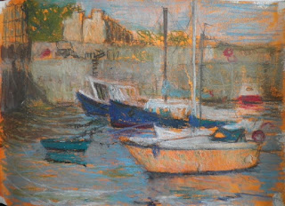
Newhaven Boats Sketch
I've painted on a coloured ground, but it was quite interesting SKETCHING on a coloured page.  In this one I've used oil crayons which forces me to be bolder than usual.  Here's another also using oil caryons.
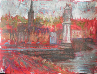
Newhaven Lighthouse Sketch
This is less successful, I think, and perhaps the dark shade of red was just a bit too dark for sketching on.  And this was at the end of the day - getting a bit tired.  I did a thumbnail of the same view in pencil which made me think it might be a good composition.  I also did this study of one of the boats in the harbour.
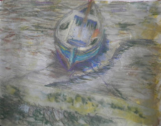
Newhaven Skiff Sketch
The boat was sitting in the mud, and I was keen to try and capture the colour and shiny texture of the mud as well as the angle of the boat.  I then noticed that the boat had both a shadow and a reflection, making it even more difficult to capture.  I did it in chalk on a greeny-yellow ground.  How do you get the colour of mud?

Anyway, I had also used a yellow ground for this sketch at the museum yesterday (it seemed like the most appropriate colour).
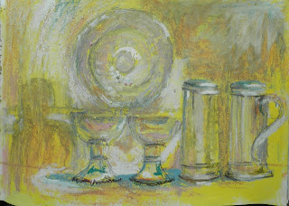
Silver Relics Sketch
The colours made me think of a Philipson painting - I suppose he used that yellow a lot in his church interiors.  Maybe that was in my subconscious when I looked at the objects in the glass case.

So now I need to make a decision on which sketch to work further on tomorrow in the studio.  A difficult choice.  But it's just great to have a full week of drawing and painting!

Monday, 16 July 2012

I wanted to do something different today, and so I set about glueing bits of paper to card, thinking about attempting a collograph.  But of course it took all day for the glue to dry.  So I got the acrylic paints out again.  Looking through one of my little sketch books I came across an image that made me think of a face.  So I did this little picture using charcoal, oilbar gouache and acrylic.
Yellow profile
This seemed like a good subject, perhaps because I sketch people in the bus - mostly in profile.  And it was sufficiently different for me to hold my interest - I haven't done this sort of a painting before.  I can't decide if this is a finished picture or not so  I've brought it home to reflect on it.
I then found another sketch
Gullane Beach detail
I did this little sketch down at Gullane beach a while ago.  It is a sketch of some windswept grass on top of a rock, but when I looked at it today, I saw something different. 
Rear View
Perception is a curious thing, isn't it?  I quite enjoyed doing these small pictures - a bit of fun.  Again, I'm not sure if this is a finished picture and indeed if it is leading anywhere.  I think I need to get a bit more focus.  Looking through the sketch book I found another image from a trip to Arran a while back.
Island Lighthouse (emerging)
I was guessing about the colour here, but I remembered that it had been a dreich day.  This picture looked a but washed out, but really it was too bright (I thought).  And the lighthouse was too clearly defined for the look I was trying to achieve.  So I added some graphite and dark paint.
Island Lightbouse (emerging)
This was more like the thing...or have I gone too far?  Well, I had run out of steam, so I'll continue it another day.
Next week I'm doing a course at Leith School of Art, based on sketchbooks, so maybe that's why I can't settle down this week!

Sunday, 15 July 2012

More Beachmen

Back in the studio on Thursday I was working on a few different pictures. 
Warmed up with a quick graphite sketch of Inchkeith.  Trying to get a little mystery and darkness into the image so have not included the Fife coast behind the island.  I did this from an earlier small sketch.  I will do a painting of this one of these days.
Inchkeith Again
Beachman 2
Then I thought I would add a little colour to the beachman pics.  This one definitely was an improvement (see previous blog), but I still need to work at the texture to make it sufficiently interesting as a picture.  I was very restrained about the colour - I think it has to be very subtle.  I also like the stance of the figure - it's not clear what he's doing.
Beachman 1
I did this similar treatment to the running beachman, but the colour is a bit stronger here.  I don't think it works so well (although I do like the purple reflection).
Why do I get drawn to this image?  Partly because I look out over the beach here at Fisherrow and see people walking when the tide is out.  They look so small against the vastness of the beach.  But maybe it's not interesting enough as a picture.  I'll keep thinking about this.

Wednesday, 4 July 2012

SUMMER? WHAT SUMMER?

Back in the studio on Monday, trying to pick up some threads.  Found it difficult to settle down to paint.  The weather has been so bad, there's a feeling of gloom settling over us (despite being away in Tighnabruaich over the weekend).  I felt like taking on a gloomy motif, based on the men who dig for bait on the beach at Fisherrow.    So my first stab at this was in charcoal and looked like this.
Beachman emerging
The challenge with this motif is trying to get the feel of the large watery space - a slightly desolate feeling.  Need to have sufficient interest as a picture.   I do little sketches of people on the beach but this is the first time I've tried to do some sort of a picture. Have shied away from it.  Anyway, I felt that black and white - or monochromatic treatment - was totally appropriate.  So on I continued with acrylic and graphite stick.
Beachman emerging
There is a little colour in this, woven into the black and white approach.  I was really exploring the different textures I could obtain with paint.  This was now looking quite mysterious, but I wasn't happy enough with the feel.  Then the figure sort of took on a life of its own.
Beachman still emerging
Yes - he turned into a man running away.  I did like this better, but maybe I've lost some of the mystery?  However I have ideas now to turn this into a more interesting and atmospheric picture.  So I hope to start again on better paper next time I'm in the studio.  And I expect it'll still be raining...