Showing posts with label homemade paints. Show all posts

Sunday, 26 January 2014

Experimenting and Playing

I didn't feel that I managed to achieve very much while away, but I did have a go at playing with some pigments and making egg tempera and glair.

Using the tempera paint, I thought this would be best suited to small paintings and I cut up some Arches card and before I knew it, I was painting little hill pictures, like this one.  The motif was based on a little image I've had in my sketchbook for ages. I found the egg tempera made me paint very precisely - I had to use a small brush - and I wanted to do something a bit looser.
 So I tried another hill motif - based on the view of Beinn Damph from the Torridon Road.  With this one, I tried to make the pencil marks stronger, as an intrinsic part of the painting.


I stuck with the hill motif, and another day I got out the beeswax. I wanted to experiment using aluminium foil encased within the beeswax. This was the best version - using a single piece of foil cut to a recogniseable shape. I thought it was interesting, but not sure what to do next......

Another day I tried using graphite powder dissolved in rabbit-skin size.  This was how it looked on Arches card. I added some water, and scattered a little salt.

And this was the same graphite 'paint' but applied to a board which had been gessoed.  Some interesting effects here...especially with the salt.

I tried another painting on a gessoed board, using a tree motif. Again the effects were kind of interesting.

I was not immune to the weather outside, and after doing a few sketches of the raging sea, I did this little painting using white-of-egg ink or glair.
But the best thing about using pure pigments is the intensity of colour. My favourite colour studies from the hols are these two.  I love the cobalt violet pigment and keep thinking of ways of using it - it's such a pure and bright colour.

And, of course, I always have to do some kind of hut. I had seen this hut as the last dwelling standing in a deserted village in Strathcarron.
Now it's back to the studio and on with some serious work (?).  But there'll always be time for play....

Friday, 10 January 2014

Nothing Is Easy

Happy New Year! (or is it?)
I seem to recall a track by Jethro Tull - 'Nothing Is Easy' and that sums up my mood at present.
The excesses of New Year are finished and I've had a clear run to get on with some painting. But am I happy with the results? ....NO....it's been a struggle this week.
I thought I would start with my pencil sketch of Slumbay....
Reflected on the composition - looking for connections and abstract values. 
 Continued working in ink and graphite and white acrylic.

I set this aside - not entirely happy - I think a landscape composition might be better.
Another day this week I wanted to try out some eggy paints, but was distracted by the stormy weather. I did a pencil sketch of the waves that I could see out of the window, and then I found myself doing a pic of the stormy sea in 'glair' - ink made from pigment and white of egg.
Stormy Sea (1)
I was surprised about how good this looked and I decided to try doing the same image again on a smaller format.
Stormy Sea (2)
What do you think?  I really liked the way the eggy ink moved around the surface. It was very fluid.
I also tried out some home-made tempera paint and finished this little pic in a mixture of tempera and glair.

Coral Beach, Applecross in egg tempera and glair

But these little pics were the best of the bunch this week....I'm not so happy about my bigger pics..for the next post.

Monday, 25 November 2013

Preparation and Experimentation

The highlight over the last week (apart from the Macmillan exhibition) was going to Edinburgh Printmakers - again. I like the discipline of working there - I feel the clock ticking. However, I think it's good to vary what you do there - I think one can get a bit stale trying to cram too much printing into one session. I now think this as on this session I spent most of my time printing from a plate I had already made. I decided to have a go in two colours - using a warm red-brown as foreground, and a cool azure blue for distance.  It turned out a bit like this (this is not the full size). I must say the colours look quite subtle in this photo. I think the actuality may be a bit brighter/greater contrast.
 I'm not sure if I like it more or less than my initial print in soft black - which looked like this.
I am thinking that printing in two colours may make it more appealing, more saleable, but personally I like the purity of the black ink. I think the marks show up more clearly. However, I don't think one is better than the other - they are just different. What do you think?

I also made a new plate. Thought it would be a good idea to do a couple of prints of Edinburgh buildings, so I re-drew this Cockburn Street building - based on a sketch I did last week before the cold weather set in! It had to be Cockburn Street: I spent so much of my previous working life at the bottom of Cockburn Street...
I then re-drew it again, this time on film. I'm wondering if I've been a bit too tight with the drawing - that's always a risk when I draw buildings.  It's ended up looking a bit different from this, but I didn't get time to do a print.....for next session, I think. And I think I'll try a sepia coloured ink (Raw Umber?)

My other idea for this week was to search for a way to do monochromatic pictures without using acrylic paint. Can I use more sustainable materials and still get interesting effects?  I happened to have some egg whites, decided to make glair (egg white ink) and tried this out using charcoal and white pigment.
In this first study I used white glair and tried to make a black ink using crushed charcoal in egg white. Not sure that the charcoal ink worked!
However, I do like the charcoal effects - a nice loose and splodgy effect. Quite stormy looking. I'm not sure what to do next with this study. Maybe the top of the hill needs to be a bit more distinct. Or maybe it's just an experiment.

Because the charcoal ink wasn't working, I decided to add a little Prussian Blue pigment to make a blue glair. It ended up behaving a bit like watercolour.
However, again I quite like this restrained effect. For the dark trees I used charcoal and painted over them with the charcoal ink. Also used pencil for some better marks.

I did a couple more studies which were I think less successful.  Nevertheless, kinda interesting!

Not quite the bold effect I was wanting.  So where next? Can't begin to think about this - I've now got a terrible cold!


Sunday, 18 August 2013

Reflecting on a week of paintmaking

I've learnt such a lot about making paint this week. It is somewhat scientific, and I found that I was thinking back to my studies for higher chemistry many moons ago.  Emulsions and polymers.  I think my favourite has been making and using Egg Tempera, particularly painting with tempera on card.  Here is the one I like best. It was really a test strip, but I like the quality of the finish.


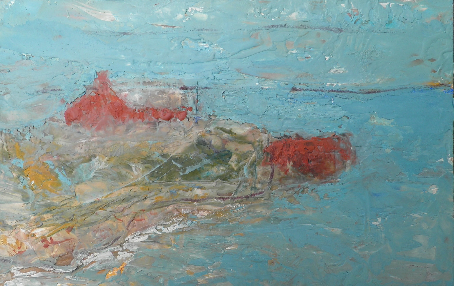
My other favourite from the week is the work we did with beeswax and encaustic.  On Friday we painted over our beeswax pictures with encaustic - a mixture of beeswax and turps, with pigment mixed in.  So my painting of the boathouse ended up looking like this.

I quite like this - and I definitely like the general effects you can get with encaustic.
My other picture - of the dog walker - I changed somewhat radically.  Jill said...why are you trying to do a figure painting when everything in your sketchbook is based on landscape images? So I converted it into a painting of Applecross.
It's not finished yet - still a bit more to do - but it's got some potential, don't you think?
So a great week and great inspiration to take forward.

Thursday, 15 August 2013

Our Paintmaking Continues

I've now just completed Day 4 of the Look and Draw course.  Yesterday was Egg Tempura: today was beeswax paint. Quite a contrast!

Yesterday we took the yolk of an egg, pierced this in order to remove the skin, mixed it with a little water, and then added pigment. Most of the pigments we mixed into a paste with a (very) little water  before adding the yolk, but not for the Titanium White which we mixed directly with the yolk (or added into other colours).  We didn't use the whitening.

Some books suggest that there are certain rules to be followed for the making and using of egg tempura, but we learned that this isn't necessary.  We used the tempura paints first on a piece of card and then on one of our gessoed grounds.  I really liked using it directly onto the card and I'm going to investigate whether or not this is long-lasting.  These images show what I managed to achieve on the gesso.  I thought I would focus on a landscape motif, based on a view from the beach at North Berwick looking over towards Fife (one of my sketches). Here was my start.

And here was how it looked after a bit of work - with the island and the Lomonds on the horizon. Sorry about the quality of the photo.  I quite like this.

I had mixed various colours, and thought I'd do an underpainting, but look at this....it looks like a piece of rusty metal.
This, of course, is my masterpiece of the week...haha. I was so pleased with this, I did another panel the same.  Joking aside, I did enjoy using the tempura - it was easy to mix a range of colours and it didn't dry out too quickly.

Today we were using beeswax. I was keen to experience this as I was hoping it might help me to be less precise about my painting style - to loosen up a bit and be more abstract.  It was a lot of fun, but I think it was mainly the fun of experiencing beeswax for the first time.  We added pigment straight into the melted beeswax and applied it to the board (no preparation required).  It was quite random and free - just adding more beeswax layers and then ironing over these or using a heat gun to re-melt the colours. But Jill reminded us that we were making pictures - what on earth was I doing?
I decided on a figure-based picture - was thinking about Peter looking after Poppy today and came up with this figure with a dog (in case it isn't clear - on reflection, maybe the legs of the figure need to be longer.) However, after this I made an attempt at a landscape view. This is based on an image of a boathouse on Jura that I've been working on. I had been thinking about this for an etching image, but here it is so far in beeswax.


Hmm. Interesting. Definitely not my usual style. Where is this going?
Encaustic tomorrow....