But the talk alone was enough to keep me focused. I knew I had to get on with things as I was moving house in July. I also wanted to work while images and thoughts were fresh in my mind.
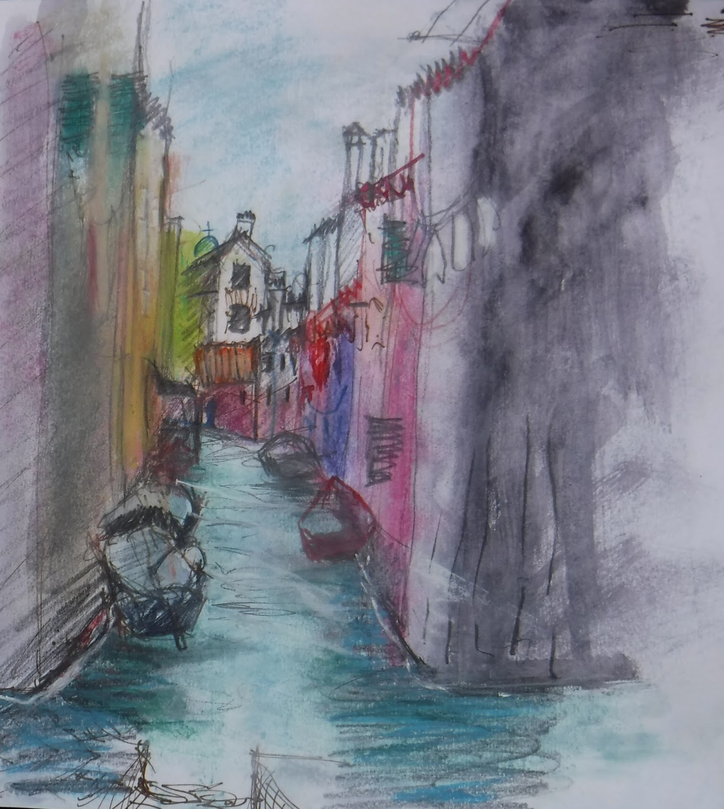
In reviewing my sketches (previous blog) I realised that I had homed in to detail a lot. The beauty of the buildings, the craft of the metal railings, the plasterwork and brick patterns - these details had attracted my attention. Also the beauty of the decaying buildings, with stucco giving way to old brick, crumbling steps, rotting wooden doorways, the spread of green mould - I loved these colours. And the typography of street names and house numbers, repeating motifs in plasterwork and in brickwork - I was fascinated by these. They are all part of the richness of the Venetian cityscape. I decided that Venice is a city that has become a landscape.
There are so many artists who have made images of Venice that it's hard not to have these images in your head when you go to paint. There are very few of us who have not fallen in love with the work of artists of the past like Turner, and contemporary watercolour artists such as Angus McEwan - masters of their craft. So the first hurdle to overcome was to try not to think about these.
And sometimes we think too much. Best really to get on and put things down on paper. So this one was a start. I was striving for the Venetian colour palette - a certain shade of red alongside Canal green.

As was this


The other print I did was also a bit dreamy, but on reflection, perhaps less obviously Venice.

I did a bit of reading around the history of Venice to understand more about its development. I read that in early years it had been a successful city state with a benign form of government that recognised the value of its workers and rewarded them accordingly. Because of its defensive position in the lagoon, it retained a separateness and independence from the rest of Italy as well as being an important and wealthy trading place. Later it expanded primarily as a place of entertainment, a playground. That 'film-set' appearance is part and parcel of the 'real' Venice. I also read articles in the press about the fragility of Venice, how threatened it is by damage caused by cruise ships and how this could be better managed but only if adjacent municipalities would work together. Also another threat emanating from the popularity of Air BandB which is driving full-time residents out of Venice.
So beauty and fragility continue to be two key aspects of Venice. I rationalised that the canals are the source of the main threat - not just from cruise ships but also from Climate Change - and the beauty lies in the craftmanship and detailing and the organic nature of the city.
These thoughts led me to focus on doorways and watergates. Rather a roundabout way to get there, perhaps. But what followed on from this was a realisation that I couldn't do my usual free and easy acrylics, but that I'd need to take a little care over details such as fanlight and window grills in order to convey that beauty. Hence I decided to use watercolour and ink.
I wanted to do really small paintings - like this study - smaller than A5.....

...but I needed a bit more room to recreate enough of the important detailing. My pics have ended up roughly A4 in size. Here's a composite with a selection. I'm not sure if I've achieved what I set out to do. I would like to continue to develop this work and perhaps even go back for more sketching...time will tell.

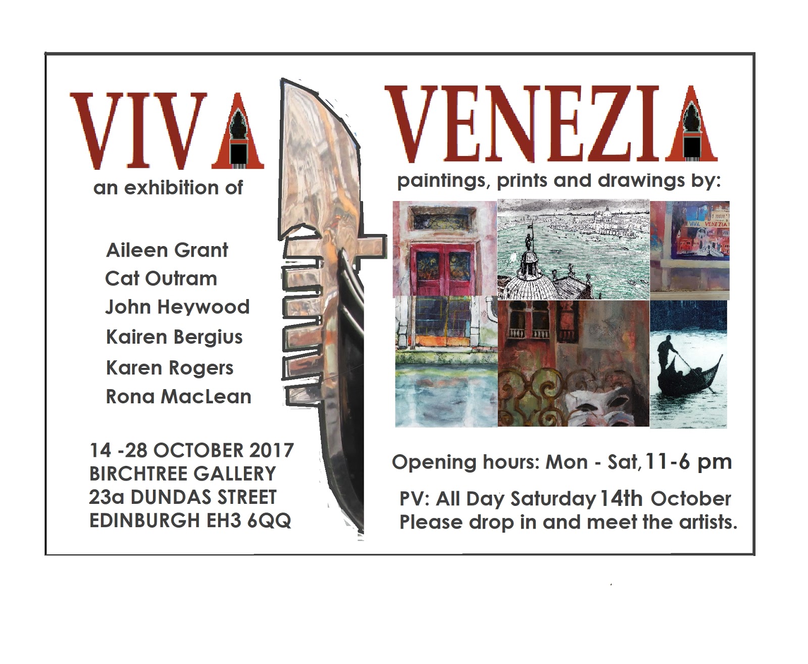
Viva Venezia
in the Birch Tree Gallery, 23a Dundas Street, Edinburgh
14th to 29th October 2017. Here are the details
Hope to see you there. :-)
No comments:
Post a Comment