Thursday, 29 December 2011

Lochcarron Days

I've been reading Van Gogh's Letters From Provence and two things strike me.  First that Van Gogh just went out and painted scenes in his locale that he felt moved to paint: he didn't appear to agonise over composition, medium or treatment - he just got on with it.  Second, that as he looked at the landscape, he saw it in terms of paint colours - ultramarine here and lemon yellow there.  There were lots of other interesting aspects to the book, but these are the key points for me at the moment.

I've also been reading a book entitled "Collage, Colour and Texture in Painting".  While this verges on advocating a formulaic approach, it is full of lots of ideas about mixing media, using various tools and it is also a good reminder about the importance of composition and a focal point.  On reflection, I'm thinking my pictures tend to lack a good focal point. (On further reflection, perhaps many of Van Gogh's pictures lack a focal point too).

The weather's been somewhat uninviting while we've been up here, and so sketching opportunities have been limited. Today was no exception so I thought I'd try a little painting.  Not in the studio, so had to use the materials I had brought - acrylics, watercolours, gouache and charcoal. Also subject to distractions...out for a little walk and off to the bottle bank (haha) etc.

Noticing that Prussian Blue is an important colour for landscape here at this time of year.  I had thought this before in the studio, but some of the dramatic scenes today (between sleet showers) highlighted the intense prussian blue of the hills in the middle distance contrasting with the burnt orange of Slumbay in the foreground.  Perhaps if I really want to get to grips with colour I should do this more often i.e. think about the colours I would use to paint what I see about me.  Perhaps I should be doing it all the time....

Anyway - I had a go at a couple of paintings today, based on photos of local scenes (easier when I'm in Lochcarron).  The first was a view over the bay near Slumbay that I had sketched in the snow the last time we were here.  I quite liked the composition, with the curvy bays leading to the houses down at the shore edge next to Slumbay.  So I figured that those houses and trees were my focal point.
Emerging picture of 3 Bays copyright Aileen Grant
The colour is not quite right as this pic was taken in electric light.  But it gives a good idea.  The other one I did was based on a view at Ardaneaskan - did a charcoal first then a pic.
Ardaneaskan View (Charcoal) copyright Aileen Grant
Emerging Picture Ardaneaskan View copyright Aileen Grant
I did a little more to the colour picture before I finished.  Hopefully I have managed to retain the feeling of abstraction.  Interesting to do the two compositions.  I like them both for different reasons (charcoal drawing more dramatic: colour pic more true to life with the open sea).  Anyway, a slightly different approach for me, using colour but trying to stay loosened up.

Monday, 19 December 2011

Last Studio Day Before Xmas


I was keen to get cracking in the studio today - I reckon it may be my last opportunity this year. I decided I would get the oil paints out to go a bit further with the pics I started the other day.  I ended up with these two.

Far Away Trees (colour) copyright Aileen Grant

Skye View from Coral Beach copyright Aileen Grant
Both of these are in oil - palette of prussian blue, ultramarine, lemon, crimson and naples yellow (and white, of course) and some graphite stick and pencil added. Far Away Trees is a bit bigger and was on an old piece of board with various things stuck down on it: Skye View is just on board.  On reflection, I think I would be better without the bts stuck on - they are a bit distracting.  Always good to try something different, though.  It was so gloomy today, I had to work in electric light, and so I'm not sure how true the colour is in these - they look kinda interesting here, but I don't expect they'll really be finished!  I do need to do more oils, I think; I need more practice as I don't feel all that comfortable handling the paint. I think it shows.

I felt much better about doing these two, below.  I did them first (to warm up a bit), but probably spent too long on them.  Here's the first sequence.
Sequence showing development of Fearnbeg cottage copyright Aileen Grant
This is a bit curious.  The top pic was where I had left this on Friday - didn't like it this morning, thought it was boring.  So I decided to lose it a bit (added gesso) - the middle pic - and then worked back into it with graphite bar, oil crayon in limited colours, and a little ink.  I do think the final version is much better, but maybe it doesn't show up in the photograph.  I also did this one....
Sequence showing development of highland village copyright Aileen Grant
This was the same idea - the top picture with the boat was what greeted me, and I was even less happy abut this - I really liked the boat but thought the composition was overly complicated.  I thought that the boat didn't work, maybe too simplistic a treatment?  Anyway, I applied even more gesso, and then drew back into it.  The castle on the hill became a church and the boat became a clump of grass.  It's nicely dark, this picture, and now I can't decide which is the better of the two black and whites.  I will try another composition with a boat in it, as I think that could be interesting, and reflecting on these half done pictures has given me some ideas.

Happy Christmas to all my readers....I probably won't be back until the new year (unless I manage some cold sketching over the Festive period).

Monday, 12 December 2011

Back in the studio...at last

Have been a bit too busy of late, not enough time to paint, not enough time to get into the studio. But I was determined to get a couple of studio days in before the madness of Christmas, and today was one. Because I hadn't been into the studio, I felt that I had lost momentum, so I was not overly ambitious for the day. I thought I would focus on the far away trees image.  I wanted to do this conposition in a square format as I thought it would work better. I started with this.
Emerging picture Far Away Trees copyright Aileen Grant
 This was just charcoal and rubbing out.  Looking at it again now, there's a lot I quite like about it.  I think the elements are carefully placed, and I may have lost some of these nice shapes later.  This is how I developed the picture, using inks and white acrylic.
Emerging picture Far Away Trees copyright Aileen Grant
I wanted to take this a little further, and I had not used any oil bar, so I thought I would try a new dark grey oil bar I had just got.  And more acrylic, etc.
Far Away Trees copright Aileen Grant
I am in two minds about whether this is better with oilbar or not.  It does make it very black, and I lose some of the interesting marks. But it also increases the drama of the picture.  I decided to have a go at the motif in colour.  Just an initial lay down of colour on a board with some textures on it.
Far Away Trees (Colour) copyright Aileen Grant.
I used a very limited palette of 2 blues, crimson allizarin, a little lemon and white.  Anyway, this needs to dry now before I put another layer of colour on.  Interesting...
I had some paint left, so I thought I'd start a colour study of another thumbnail.  It's also kinda interesting.
Skye Ridge copyright Aileen Grant
 As well as the oil paint, I used a blue oil crayon, drawing into the paint.  I really like the effect achieved on the far away hills of Skye.  It'll be a challenge to decide how to take this to the next stage and not lose the interest.

By this time the light was fading in the studio, and so I decided to finish with another black and white picture. This one was based on my recent Lochcarron sketch, using charcoal, ink and acrylic - no dark grey oilbar this time.....
Dark Hill, Lochcarron copyright Aileen Grant
I was quite pleased with some of this.  What I liked was the way the marks turned out on the distant shore, at the foot of the dark hill.  For the first time I think I have managed to use marks to convey the feeling of the landscape, without being too literal.  Progress... perhaps...

Just watching pictures of Iceland on the telly.  Looks amazing.  I want to go there!  I want to paint there!


i

Sunday, 4 December 2011

Lochcarron in the Cold

 Up north for the weekend, and it's pretty cold.  However, we still managed to get a few walks, and I have persevered with a bit of sketching.  Brief forays for quick charcoal sketching, one at a time, then back indoors or back into the car to warm up. There's been a cold wind - always makes for difficult sketching.

Anyway, managed a few sketches in Lochcarron itself.  This first one looking west along the shore, but omitting Slumbay for a change.  I had spotted this black hill standing out against the rest of the background (mostly grey and cold-looking), so I had a go at it.

Sketch of Lochcarron shoreline looking west copyright Aileen Grant
 I had a go later on at painting it - turned out like this....
Colour sketch of Lochcarron Shoreline looking west copyright Aileen Grant
Ok - this is not a 'real' sketch as I did it in the warmth of the cottage - but it was done almost in situ.  I do feel that the triangular hill is somewhat iconic - an important element in the setting of Lochcarron - and I think that's why I was drawn to it.  And this was an attempt to capture the gloomy colour.  I did it on dark paper with acrylic paint. It's a start.
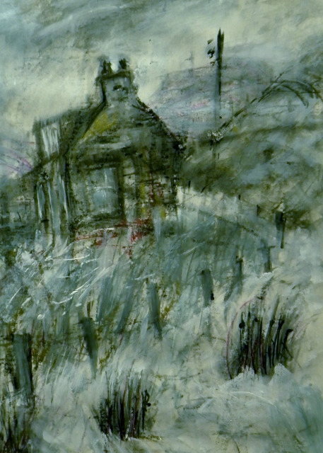
Another sketch was Seabank Cottage again.  It was too windy to sketch it from the shore, and I've already done that a few times, so I found a view looking east back towards the cottage.


Sketch of Seabank Cottage with Boat copyright Aileen Grant
I liked the position of the upturned boat in front of the cottage, providing another splash of bright(ish) white, same as the gable, and I liked the contrast with the dark stone wall.  There were actually more poles in this picture (clothes poles and washing lines) which I've left out for the moment, but I may add these in if I do another version.

I did another sketch yesterday over at Kishorn - my favourite place - but sketching was curtailed by a heavy shower of sleet.  So this one is a bit rough and ready.  Saw an otter here too - it just scooted across the road in front of me - I was amazed!  The gloomy light was somewhat strange, making the distant hills of Skye look bigger than usual and I wanted to try and capture this.

Sketch of Kishorn Bay copyright Aileen Grant
I have not managed to capture the mistyness of the hills in this sketch.  Very difficult this, and only possible in paint, I think.  However, I have taken a photo and I'll have a go at it back in the studio.

Anyway, it's pretty cold now and snow is forecast.  Roads already seem to be bad elsewhere, and I have to drive back to Musselburgh tomorrow.  So I'm looking forward to a bit of fun, haha....


Friday, 25 November 2011

Extreme Sketching (Almost)

What a day! What a day to go sketching! Despite the atrocious weather today, we had a go at sketching in Portobello.  Well, all I can say is..."Thank goodness for the Beach House Cafe!" .....http://www.thebeachhousecafe.co.uk/
But on the basis that the weather can add an extra dimension, the four of us who turned up for a bit of a sketch did make a go of it.......then we repaired to the cafe where we continued to sketch the sea view.

By the time we made a start, a rainstorm was already approaching.  The colour looking over the Forth was fantastic, and a couple of us tried to capture this - I tried it in pastel.  Here's my effort.
Sketch of Inchkeith from Portobello copyright Aileen Grant
 
I was trying to capture that strange luminous dark turquoise of the sea - the stormy colour - it's not quite as bright as this - but down came the deluge.  And it was mighty cold - a high wind chill factor.  So I packed up to find shelter.  Then I tried bits of sketches - how difficult it is to sketch in the rain!  The charcoal was blobbing, the paper was blowing about, etc etc.
In short...I gave up trying to brave the elements, went back to the cafe, and there were the pals, sketching in comfort!  So I attempted another sea view, in pencil this time as I was out of the wet.
Sketch of Largo Law with Table + Chairs copyright Aileen Grant

I'm afraid that my efforts were definitely the worst of the bunch, but I don't have the evidence to show this.  Maybe we'll start a sketching blog. Anyway, despite the awful weather it was a good attempt and we all managed to do something!  It was also great to catch up - we went on to Art'sComplex after this to eat our sandwiches and have a chat - and arrange the next sketching session.  In January!

Monday, 14 November 2011

Another Attadale View

Wasn't feeling so well today but still managed a bit of painting. I almost got distracted (thinking about some recent urban sketches), but no...I knew I must stay focused on my thumbnail template.  As usual I wanted to 'draw myself in' and make a start to my session with charcoal, thinking about a black and white picture.  So I decided to focus on a view across Loch Carron to Attadale...again.  I had not tried a black and white of this picture, so I thought that doing this same view in a different medium might produce an interesting result.  I started with this.
Attadale view (scribble) copyright Aileen Grant
Now, this was virtually a scribble of a start.  However, as always, there is something so lively about this first scribble.  It feels rough and full of energy, it's got lots of looseness (which is what I am seeking to achieve) but it would be dissatisfying to try and leave it as a finished picture.  Why? Well, there is no detail underpinning it.  It would not hold the viewer's interest.  Anyway, leaving it was not an option.  So it was out with the rubber and on with the oilbar.  So a few minutes later it looked like this.
Attadale View (blurry scribble) copyright Aileen Grant
I'm nt always convinced that I do the right thing with oilbar.  Am I overdoing it?  Have I done the marks in the best way?  I'm wondering if these marks are a bit too rigid and vertical.  Really, I'm aiming for randomness, to achieve unexpected results.  Anyway, I carried on with a few marks using oil crayons, then white acrylic and inks (black, blue and red).  Finally I decided to crop the right hand end off the picture to make a more contained composition. So now it looks like this.
Attadale View (Black and White) copyright Aileen Grant
It's the white acrylic which gives the opportunity to loosen the picture up, allowing a bit of dreaminess for the sea and the sky.  This cropped composition is also much better - similar to the composition in the square coloured version.  (I only realised this with the photograph.)  I also worked hard on the shore treatment - pebbles, rocks and shoreline - to make sure there was enough interest. There is actually a bit of subtle colour in there! Of course this is larger than the coloured thumbnails, so maybe I'm nearly ready to attempt a larger picture.  But frustratingly I'm not going to be able to get time in the studio for a little while.  Can I keep the momentum going?

Monday, 7 November 2011

In the Studio....Continuing

Had a busy weekend with the Morningside Artkist exhibition  - was up there on Friday and Saturday and looked in on Sunday too.  It was busy and I got some good feedback on my pictures, and a few sales. (Not many pictures sold overall). People mostly liked my black and white pictures and my drawings - can't say I'm surprised.  Anyway, I found it a little bit difficult to settle back into painting today but I decided to keep focused on my thumbnails.  As usual, I started doing a black and white exercise to get into the mood for painting.  I had a painting on the wall of Fisherrow Harbour and thought I would try it in black and white. I got so absorbed that I forgot to take a photo until I got beyond the charcoal stage.
Emerging Fisherrow Harbour B+W copyright Aileen Grant
I carried on with more ink and white acrylic, remembering that the floor of the harbour was much darker than the harbour walls.  I took it as far as this.
Fisherrow Harbour B+W copyright Aileen Grant
I wasn't pleased with this at the time, but looking at it now, it looks quite interesting.  I was having a bit of fun with the muddy harbour, spraying lots of water as well as mixing the ink and acrylic.  It's helping me to create a dark and interesting space which is really my aim.
I got the oil paint out in the afternoon and returned to the applecross pictures. I had already painted this small  (A5) version of the view over to Attadale.
Attadale oil colour study copyright Aileen Grant
I quite liked the colour treatment in this, and the brushwork (it is just a small picture), but I thought the composition could be improved. I had already made a start to a small square picture which I had prepared with an orange acrylic ground.  I added some pencil marks in a similar treatment to my big pictures.
Attadale oil colour study copyright Aileen Grant
Actually, I quite like this now, this light treatment which allows the orange underneath to shine through.  It has a delicacy which may have been lost now, with this.
Attadale oil colour study copyright Aileen Grant
Apart from the difference in composition, in this new version I have used Prussian Blue in the mix (not used in the earlier verion).  It gives a richer colour.  So I think this composition has some potential and I may take it further in a larger square picture.