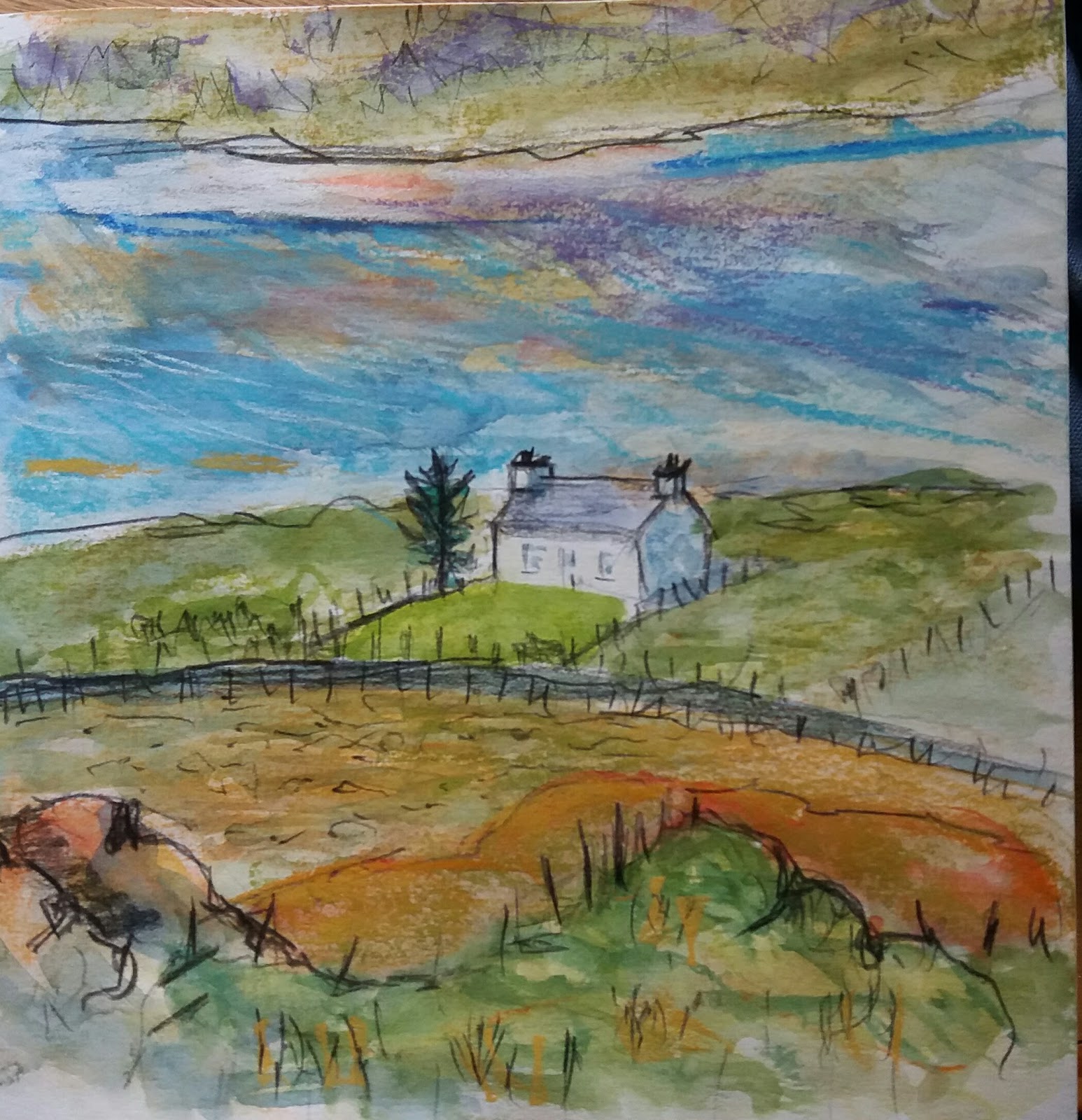
It seems that we've just hit a spell of good weather up here. Sunny crisp days. The hills and summits are so clear. Had a bit of a hillwalk in Strathcarron yesterday and today I had to run over to Torridon to deliver some calendars, so I took the opportunity to do a bit of sketching.
At this time of year, the grasses are wonderful shades of orange and ochre, and the deer grass has sent out its delicate long stems. Here's the sketch I did yesterday on a walk in the Strathcarron hills above Achintee. I was trying to get the pattern of the shadows on the hillside, shadows cast by the rocky outcrops. And the lochan kept changing colour as the wind changed. I was able to take a bit of time as it was warm enough and I was quite pleased with this.
Today was similar. The hills were clearer than ever but there was a cold wind blowing.The shore of Upper Loch Torridon looked cold, in shadow.
Then on through Glen Torridon, stopping for a sketch of Liathach. We stopped at the second car park where there is a stand of pine trees. By this time there was a small cloud sitting on top of Liathach which I was viewing from the east.
On our way back I had time for another sketch of Liathach, a view from the south this time. We walked a bit along the lochside path and I spied a good view with a host of Torridon pines in the shade in front of the hills.
And as a wee extra, Beinn Damh was catching some intense light with interesting shadows so I did a last quick sketch before I headed home.
Lots of material for a few paintings, but this lovely weather is very distracting!
Showing posts with label wildness. Show all posts
Monday, 19 November 2018
Friday, 19 January 2018
Fresh Start
The start of another year always seems like an opportunity for a fresh start and this year is no exception. Last year was just a bit too busy and this blog has definitely suffered. And the blog is important to me/my work as it helps me to reflect on what I'm doing (and not doing!). Ah well...
I've been very distracted by the snow - we've had so much of it - and every time I pick up a brush, I just want to use black and white. Perhaps this is a good thing, a good restraint. I sometimes use a little bit of colour - as in this one, which is a view of the bay and shore near where I live.
I quite like the looseness and lack of detail I've managed to achieve in this one. Perhaps it's looser because this started out as a larger pic and I've cut it down. It's a much better composition now.
I did this pic at the same time, using the same palette of black, white and some blue and brown.
I think this one is just a bit too studied and static, but then it was on a very cold still day. The thing about snow is that you get these heavy dark lines appearing and this helps me to focus on the structure of a landscape. I've been thinking about this more in snowy studies I have done over the last 2 weeks. Here's a charcoal drawing which is based on a sketch - I loved the lines of the shore disappearing into the sea.
Then I tried it in ink and acrylic with a little gold oilbar. But it's not nearly as satisfactory as the charcoal drawing, is it?
I think the angles of the shore are not quite right and this is because I did it sitting down, not at the easel - should know better! I also thing the hills look a bit boring - a slab of white. However I thought the gold oilbar was a good idea, so I used it in this view which I did last week too.
But I'm not very satisfied with this - I think it's a bit woosy, trying too hard to be realistic, but being neither one thing nor another in style. I had another go at it today, with this result. I find this much more satisfying, being bolder and bleaker. More graphic, I suppose. And the composition perhaps works better (for a mood of bleakness).
I did do one other woosy one last week, which is this one of the path alongside the shore. Again it looks overworked and scratchy, but some of the inky marks are quite good, and the light is not bad. I was getting a good effect by mixing yellow ochre with white. I haven't re-done it as I'm not sure if this composition really works.
I can only conclude that although I have made a start to the year, there's a lot more work to be done. Choice of materials is so important, and I need to focus on the materials which produce the best results for me. Boldness with charcoal or graphite usually gets me off to a good start, I think. The challenge is always there.
I've been very distracted by the snow - we've had so much of it - and every time I pick up a brush, I just want to use black and white. Perhaps this is a good thing, a good restraint. I sometimes use a little bit of colour - as in this one, which is a view of the bay and shore near where I live.
I quite like the looseness and lack of detail I've managed to achieve in this one. Perhaps it's looser because this started out as a larger pic and I've cut it down. It's a much better composition now.
I did this pic at the same time, using the same palette of black, white and some blue and brown.
I think this one is just a bit too studied and static, but then it was on a very cold still day. The thing about snow is that you get these heavy dark lines appearing and this helps me to focus on the structure of a landscape. I've been thinking about this more in snowy studies I have done over the last 2 weeks. Here's a charcoal drawing which is based on a sketch - I loved the lines of the shore disappearing into the sea.
Then I tried it in ink and acrylic with a little gold oilbar. But it's not nearly as satisfactory as the charcoal drawing, is it?
I think the angles of the shore are not quite right and this is because I did it sitting down, not at the easel - should know better! I also thing the hills look a bit boring - a slab of white. However I thought the gold oilbar was a good idea, so I used it in this view which I did last week too.
But I'm not very satisfied with this - I think it's a bit woosy, trying too hard to be realistic, but being neither one thing nor another in style. I had another go at it today, with this result. I find this much more satisfying, being bolder and bleaker. More graphic, I suppose. And the composition perhaps works better (for a mood of bleakness).
I did do one other woosy one last week, which is this one of the path alongside the shore. Again it looks overworked and scratchy, but some of the inky marks are quite good, and the light is not bad. I was getting a good effect by mixing yellow ochre with white. I haven't re-done it as I'm not sure if this composition really works.
I can only conclude that although I have made a start to the year, there's a lot more work to be done. Choice of materials is so important, and I need to focus on the materials which produce the best results for me. Boldness with charcoal or graphite usually gets me off to a good start, I think. The challenge is always there.
Wednesday, 19 October 2016
Harris in Glorious Colour.
Just back from a short break in Harris. 10 days of the best Autumn weather ever. And, of course, time for a few sketches.
Last time we went to Harris we never saw the top of Clisham: this time we climbed it. We did it the day after we arrived just in case the weather didn't hold. It was quite a good day - good enough for a sketch on the top - and what a view we got, down over the ridges of the North Harris Hills. Even managed to make out St Kilda on the horizon.
Day 2 was a bit windy and so we explored a few beaches. There was Luskentyre, of course.
And the stormy seas on Traigh Iar
And the beach at Horgabost (Niosabost) - a quick sketch as the sand was blowing into my eyes.

Day 3 - a bit more energetic. We headed to Huisinis, planning to walk over to Loch Cravadale. It was very windy, and the wind was funneling down the valley, making sketching difficult. Nevertheless, I sheltered behind a rock and managed to do this. Wanted to capture the stormy sea!
And I loved the view of the three lochs
And I managed a very quick sketch of Scarp and the other wee island.
Day 4 we had a bit of a lazy day around the cottage.
We were in a lovely cottage at Seilebost http://www.visitouterhebrides.co.uk/accommodation/seol-mara-seilebost-p553931
And those pale evening colours
Day 6 - a trip to Scalpay and the lighthouse at Eilean Ghlas. The Shiants were clear and I wanted to capture their shape.

Lunch in that great seafood place in Scalpay https://www.facebook.com/NorthHarbourBistro/ (well recommended), and a couple of sketches on the way back to the cottage.
Day 8 - it rained a little! But it was good enough for a walk up the Coffin Road. Trying so hard to work out how to capture the grain of the landscape, the look of the rocks and the grass.
And coming back - more rocks and grass, but a view over one of the lochans to Luskentyre.
Day 9 - over to the Golden Road, and our favourite place - walking out from Manais. I love the old fishing pools and this is a great example. And that's the mainland on the horizon.
Found an island and a half to sketch at lunchtime (Eilean Mhanais)
And after the walk we headed south again and stopped at this point in the bay of seals.
And then another quick sketch of a lochan on the road back over to Leverburgh, trying to get the colour of the moorland.
Day 10 - weather still good - off to climb the hill at Northton - Ceapabhal. A steep little climb on a hot day. Great view from the top over to to North Uist and beyond...looking into the sun. Could also see St Kilda and Hirta clearly from the top.
Then a quick sketch back at the bottom of the hill looking over Northton beach. Great lazybeds at the bottom of the hill.
And finally a last (very quick) sketch of Seilebost beach, looking toward Luskentyre. Still with the amazingly bright colours.
We were so lucky. I went to Harris hoping for some moody skies and stormy atmosphere, but I got some beautiful weather with lovely colours. Much more challenging for me to take forward!
And a bit of decision-making - which sketches have the makings of a good picture?
Watch this space....
Last time we went to Harris we never saw the top of Clisham: this time we climbed it. We did it the day after we arrived just in case the weather didn't hold. It was quite a good day - good enough for a sketch on the top - and what a view we got, down over the ridges of the North Harris Hills. Even managed to make out St Kilda on the horizon.
Day 2 was a bit windy and so we explored a few beaches. There was Luskentyre, of course.
And the stormy seas on Traigh Iar
And the beach at Horgabost (Niosabost) - a quick sketch as the sand was blowing into my eyes.

Day 3 - a bit more energetic. We headed to Huisinis, planning to walk over to Loch Cravadale. It was very windy, and the wind was funneling down the valley, making sketching difficult. Nevertheless, I sheltered behind a rock and managed to do this. Wanted to capture the stormy sea!
And I loved the view of the three lochs
And I managed a very quick sketch of Scarp and the other wee island.
Day 4 we had a bit of a lazy day around the cottage.
We were in a lovely cottage at Seilebost http://www.visitouterhebrides.co.uk/accommodation/seol-mara-seilebost-p553931
It was lovely to walk out on the beach
And those pale evening colours
Day 5 - off to Rodel and the walk to Borrisdale. It was such a warm day
and the colour of the grass was such an intense green. Lunch
overlooking the bays with Skye and the mainland on the horizon.
We walked out on the Dun. Looking back, I loved the abstract shapes (very quick sketch!)Day 6 - a trip to Scalpay and the lighthouse at Eilean Ghlas. The Shiants were clear and I wanted to capture their shape.

Lunch in that great seafood place in Scalpay https://www.facebook.com/NorthHarbourBistro/ (well recommended), and a couple of sketches on the way back to the cottage.
Day 7 -a quieter day. But still time for sketching - this one is of Ben Luskentyre from the cottage.

Day 8 - it rained a little! But it was good enough for a walk up the Coffin Road. Trying so hard to work out how to capture the grain of the landscape, the look of the rocks and the grass.
And coming back - more rocks and grass, but a view over one of the lochans to Luskentyre.
Day 9 - over to the Golden Road, and our favourite place - walking out from Manais. I love the old fishing pools and this is a great example. And that's the mainland on the horizon.
Found an island and a half to sketch at lunchtime (Eilean Mhanais)
And after the walk we headed south again and stopped at this point in the bay of seals.
And then another quick sketch of a lochan on the road back over to Leverburgh, trying to get the colour of the moorland.
Day 10 - weather still good - off to climb the hill at Northton - Ceapabhal. A steep little climb on a hot day. Great view from the top over to to North Uist and beyond...looking into the sun. Could also see St Kilda and Hirta clearly from the top.
Then a quick sketch back at the bottom of the hill looking over Northton beach. Great lazybeds at the bottom of the hill.
And finally a last (very quick) sketch of Seilebost beach, looking toward Luskentyre. Still with the amazingly bright colours.
We were so lucky. I went to Harris hoping for some moody skies and stormy atmosphere, but I got some beautiful weather with lovely colours. Much more challenging for me to take forward!
And a bit of decision-making - which sketches have the makings of a good picture?
Watch this space....
Sunday, 17 May 2015
A Spot of Reflection
It's harder than people think 'being an artist'. No, really! Self-doubt is a constant companion, made worse by the highs and lows of exhibiting and selling (or not selling!) work. But never mind the generalities, it's time I reflected on what I've done over the last month, what's working for me and what is not.
After the drawing episodes (see previous post), I had a spell of printmaking using a gelatine plate. I was using bits of bracken and shreds of sacking to act as masks and create textured 'ghost' prints.
This felt like fun rather than work....
Then I tried cutting shapes out of textured material...
Using thread and bits of lace as well as fish shapes...
And again, mixing shapes and textures...
Becoming more abstract...
And creating bolder abstract shapes....
Out of all this experimentation I devised a set of basic rules to follow in order to achieve a pleasing result. I used these for a workshop I ran at The Schoolhouse Gallery in Dornie last weekend. There's a randomness about the gel printmaking process, as I suppose there is about all monoprinting - or monotyping to be pedantic - and it certainly makes me think in more abstract terms about colour, texture and form....which is a jolly good thing. I think there is a lot of potential for me to use this process to devlop the way I see and use coloured shapes and move away from realism towards abstraction. It keeps me focused on the aesthetics of putting together patterns of different colours that bears no relation to observational drawing.
However, I wanted to get some painting done this month too and I'm determined to work more in oils just to see what kind of results I can achieve. I started with a couple of ideas for lochan pictures, based on some sketches I did while out walking. Here's what I achieved the first session
And this
They look quite good at this scale, but I'm not at all sure about them. Need more work, I think but there is that risk of overworking. And they are a bit too realistic, not abstract enough.
But then I was really doing these to paint myself into another pic I had started a couple of months ago. Here it is...
I was quite pleased with this but thought it needed more work, and it had some elements that were a bit too realistic and the composition looked a little too contrived, too studied. It is an attempt at an abstracted composition which I had worked out through drawing. My original little study, based on an observational sketch, was this (I've polished this up now and may get it framed - ha!).
What I liked about the scene was the orange island and the blue lochan and how they are opposites and kinda balance each other. However, the oil version wasn't quite working. So I went back to drawing and then back into paint - trying NOT to be realistic - and this is as far as it's got now.
Getting better, I think. The composition has improved, but maybe the colour is too bright now. I did like the coldness of the earlier version. But that was done in a different season!
I know that I must keep focused on what am I trying to achieve. I'm not trying to create pretty pictures or cartoons: I'm trying to say something about what the landscape means to me: what it says to me - beauty, ruggedness, wildness; what I observe - quirkyness and delicacy; what I feel - preciousness, ephemerality. But there's no point in describing it in words...the challenge is to channel all of that into paint ... ha!
After the drawing episodes (see previous post), I had a spell of printmaking using a gelatine plate. I was using bits of bracken and shreds of sacking to act as masks and create textured 'ghost' prints.
This felt like fun rather than work....
Then I tried cutting shapes out of textured material...
Using thread and bits of lace as well as fish shapes...
And again, mixing shapes and textures...
Becoming more abstract...
And creating bolder abstract shapes....
Out of all this experimentation I devised a set of basic rules to follow in order to achieve a pleasing result. I used these for a workshop I ran at The Schoolhouse Gallery in Dornie last weekend. There's a randomness about the gel printmaking process, as I suppose there is about all monoprinting - or monotyping to be pedantic - and it certainly makes me think in more abstract terms about colour, texture and form....which is a jolly good thing. I think there is a lot of potential for me to use this process to devlop the way I see and use coloured shapes and move away from realism towards abstraction. It keeps me focused on the aesthetics of putting together patterns of different colours that bears no relation to observational drawing.
However, I wanted to get some painting done this month too and I'm determined to work more in oils just to see what kind of results I can achieve. I started with a couple of ideas for lochan pictures, based on some sketches I did while out walking. Here's what I achieved the first session
And this
They look quite good at this scale, but I'm not at all sure about them. Need more work, I think but there is that risk of overworking. And they are a bit too realistic, not abstract enough.
But then I was really doing these to paint myself into another pic I had started a couple of months ago. Here it is...
I was quite pleased with this but thought it needed more work, and it had some elements that were a bit too realistic and the composition looked a little too contrived, too studied. It is an attempt at an abstracted composition which I had worked out through drawing. My original little study, based on an observational sketch, was this (I've polished this up now and may get it framed - ha!).
What I liked about the scene was the orange island and the blue lochan and how they are opposites and kinda balance each other. However, the oil version wasn't quite working. So I went back to drawing and then back into paint - trying NOT to be realistic - and this is as far as it's got now.
Getting better, I think. The composition has improved, but maybe the colour is too bright now. I did like the coldness of the earlier version. But that was done in a different season!
I know that I must keep focused on what am I trying to achieve. I'm not trying to create pretty pictures or cartoons: I'm trying to say something about what the landscape means to me: what it says to me - beauty, ruggedness, wildness; what I observe - quirkyness and delicacy; what I feel - preciousness, ephemerality. But there's no point in describing it in words...the challenge is to channel all of that into paint ... ha!
Monday, 20 October 2014
A Head Full of Hills
Just back in Musselburgh from Lochcarron with lots of images of the hills in my head. I did a pile of sketching and a bit of work. Now I have to make decisions - what should I focus on next?
I tried working on this image of trees beside a lochan. I really thought there was potential for a moody pic with lots of abstract textures. It started off like this.
Then I added more colour.
I think this photo makes the pic look better that it really is. I wasn't very happy with this result, so I started again.
I think I've used a rather confused palette, and I'm not confident about the composition, so I still wasn't happy and set it aside.
I moved on to Beinn Alligin. I drew a motif out first in charcoal, based on an earlier charcoal sketch I had done at the roadside at Annat. I love this view of Alligin with the seaweed shore in the foreground!
Then I moved onto paper that I had previously prepared with gesso and ultramarine and some pva, and I drew it out again.
Then I added gouache and acrylic, and more pencil marks.
Actually, I quite like the palette I had used on this, but I thought it needed a bit of orange and green for some reason. Clearly I was not thinking clearly!
On reflection, I realised that the extra colour did not help the painting and at this point I thought the hill looked a little too high - as if I'd distorted the perspective. So I painted in more sky.
But then I noticed that the angle of the hill was now wrong....it looked as if it had been tamed! And I realised that there were too many different colours. So back to the Prussian Blue in order to recapture the drama.
I think this is closer to the result I was after - moody and dramatic. Sadly the colour is not as pure and exciting as the earlier version (but maybe more realistic?) and I'm still not sure about the foreground marks, but I feel as if this painting has had enough attention. So I've set it aside for the moment.
I did try a couple of other images.
Here's a stab at Beinn Eighe viewed from the path to Slioch. I used acrylic, gouache, pencil and conte.
And here's a stab at Slioch - a view looking up from the path, again based on a charcoal sketch I did on our walk.
I like the little bit of colour on the hill.
But it was back in the studio today, thinking about what to take forward. More anon...
I tried working on this image of trees beside a lochan. I really thought there was potential for a moody pic with lots of abstract textures. It started off like this.
Then I added more colour.
I think this photo makes the pic look better that it really is. I wasn't very happy with this result, so I started again.
I think I've used a rather confused palette, and I'm not confident about the composition, so I still wasn't happy and set it aside.
I moved on to Beinn Alligin. I drew a motif out first in charcoal, based on an earlier charcoal sketch I had done at the roadside at Annat. I love this view of Alligin with the seaweed shore in the foreground!
Then I moved onto paper that I had previously prepared with gesso and ultramarine and some pva, and I drew it out again.
Then I added gouache and acrylic, and more pencil marks.
Actually, I quite like the palette I had used on this, but I thought it needed a bit of orange and green for some reason. Clearly I was not thinking clearly!
On reflection, I realised that the extra colour did not help the painting and at this point I thought the hill looked a little too high - as if I'd distorted the perspective. So I painted in more sky.
But then I noticed that the angle of the hill was now wrong....it looked as if it had been tamed! And I realised that there were too many different colours. So back to the Prussian Blue in order to recapture the drama.
I think this is closer to the result I was after - moody and dramatic. Sadly the colour is not as pure and exciting as the earlier version (but maybe more realistic?) and I'm still not sure about the foreground marks, but I feel as if this painting has had enough attention. So I've set it aside for the moment.
I did try a couple of other images.
Here's a stab at Beinn Eighe viewed from the path to Slioch. I used acrylic, gouache, pencil and conte.
And here's a stab at Slioch - a view looking up from the path, again based on a charcoal sketch I did on our walk.
I like the little bit of colour on the hill.
But it was back in the studio today, thinking about what to take forward. More anon...
Subscribe to:
Posts (Atom)