 |
| Victoria Street thumbnail copyright Aileen Grant |


 |
| Series of Emerging pictures of Victoria Street copyright Aileen Grant |
I don't appear to have taken a very good photo, but it gives the general idea. I'm afraid I don't find pictures of buildings all that exciting, and because of that I'm not a good judge of the end result. I like the thumbnail better than the finished picture so perhaps it needs more work - I need to darken down some of the shopfronts, providing a better focal point. But the finished pic was not too far away from the thumbnail.
I did another picture today which I think I'm a little bit happier with. Here is the sequence.


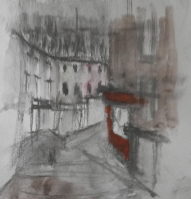
 |
| Series of emerging pictures Victoria Street with Highland Free Kirk Steeple copyright Aileen Grant |
The colour of this is much more interesting (perhaps a bit Turner-esque? not by design, I must say). It may point to a good approach to depicting the buildings of Edinburgh. I started with underpainting of gouache - magenta and indian yellow - then drew into it and added some pale acrylic. At that point I didn't want to lose all the pure colour, so I put some masking tape over, and carried on with ink, gouache and acrylic. Oh, and graphite and charcoal. So it was a right mixture. But the building has ended up looking quite vibrant. It has a warmth which makes it interesting, I think - at least it appeals to me more than the watered down colours I did on Friday. And the steeple is nice and black, emerging out of the gloom of the sky. The only thing I'm not sure about is the composition.....the building is a little low in the page, but then this accentuates the narrowness of the street and the importance of looking up....as always...difficult to get everything right.
No comments:
Post a Comment