I've waited a long time to do an etching course, and finally I've done it this week at Edinburgh Printmakers with Bronwen Sleigh as tutor. It's been brilliant...but my brain is tired - so much to remember! Here's a selection of the prints I've produced so far.
This first is a photo-etching I made by scanning in a charcoal sketch I did of a boat at Dunbar - at Cromwell Quay. Using this image, I did a photo etching onto a copper plate, and then I added some textures, under Bronwen's supervision. A bit of a pick and mix - some textures work better than others, don't you think?
Being a bit of a purist, I was keen to do etching in a more traditional, hands-on way, directly into a copper plate. I had my favourite image of the Applecross Fishing Hut in my mind and etched this freehand into a 'soft ground' on top of a copper plate. We then did aquatinting as a follow-on (to provide more tone) and it turned out like this (printed in Raw Umber coloured ink - to be sepia-like)....
I then decided to re-ink with Prussian Blue and reprint on a white paper, resulting in this image which to me looks a bit more interesting and bold......
Now I'm not sure which is better - I suppose they are just different!
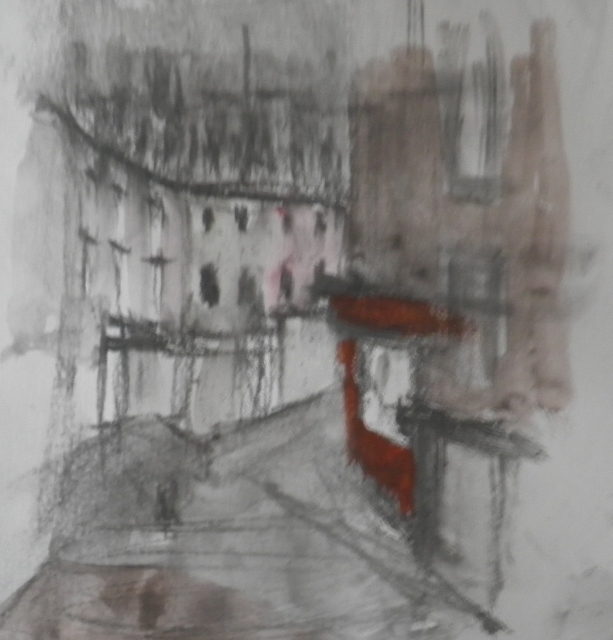
Today was the last day of the course, and we were to use Toyobo plates. In the class we had talked about this yesterday and in advance I put together a base plate using an old sketch I had done in the Old Town, one of my printed images, newsprint, white acrylic and indian ink. Of course, I didn't get round to doing this until 11 pm last night, and this morning I wasn't sure about whether or not to use it, but I was persuaded to do so in the class. The print which I pulled from the Toyobo plate turned out like this.
It's kinda interesting, isn't it? Quite different from my drawing-based images.
So I have now applied for Associate Membership of Edinburgh Printmakers and hope to develop my printing skills further in the weeks to come. So exciting for me!
Showing posts with label Edinburgh studies. Show all posts
Thursday, 25 July 2013
Monday, 6 August 2012
Sketch development
I was continuing with developing the sketches I did on Jenny Martin's course. In the sketchbook, I had done this little quick pencil sketch when I was at Newhaven - almost a thumbnail. Here it is.
Jenny had encouraged us to take photocopies and change the scale. In doing this, I thought it might look a bit more interesting with larger figures in the foreground. I therefore increased the scale of the figures to make a different picture. This of course meant I had to change the scale of the lighthouse for the picture to make visual sense. So it ended up like this.
Back in my studio, I decided to have a go at painting the scene with the larger figures, but I was not certain about putting figures into a picture like this. What do the figures signify? Surely there should be some deeper meaning or symbolism to figures to make the picture interesting? I thought then I would put one figure and a ghostly figure, and so it ended up looking like this.
I don't think I like the ghostly figure so I'll probably paint it out. But the juxtaposition of the lighthouse and the church kinda works. This is in oil pastel mostly, with some pencil and a little acrylic.
I did another version of this Newhaven view...without figures. However I was trying to do something clever with the lighthouse. So that ended up first of all looking like this.
Now, I didn't think this worked at all, and so I tidied up the lighthouse. I also managed to shrink it significantly and so now the scene no longer looks like Newhaven.
I quite like the palette as it is so gloomy, and the pink in the sky chimes with the pink granite of the lighthouse base (which actually is realistic). Lighthouse still needs fixed (it's a bit skew-whiff), but maybe it works as a picture despite the lighthouse being miniaturised. This one is in oil pastel, acrylic and pencil - bit of a mixture. Will see how it looks when I'm next in to the studio.
Jenny had encouraged us to take photocopies and change the scale. In doing this, I thought it might look a bit more interesting with larger figures in the foreground. I therefore increased the scale of the figures to make a different picture. This of course meant I had to change the scale of the lighthouse for the picture to make visual sense. So it ended up like this.
Back in my studio, I decided to have a go at painting the scene with the larger figures, but I was not certain about putting figures into a picture like this. What do the figures signify? Surely there should be some deeper meaning or symbolism to figures to make the picture interesting? I thought then I would put one figure and a ghostly figure, and so it ended up looking like this.
![]() | ||
| Looking out to sea |
I did another version of this Newhaven view...without figures. However I was trying to do something clever with the lighthouse. So that ended up first of all looking like this.
Now, I didn't think this worked at all, and so I tidied up the lighthouse. I also managed to shrink it significantly and so now the scene no longer looks like Newhaven.
![]() |
| Lighthouse and Church |
Wednesday, 25 July 2012
A week of sketching
Midway through doing a week's summer school at Leith School of Art. Doing a course with the artist Jenny Martin, focusing on sketchbooks and the connection between sketches and finished pictures. It's been interesting so far. We've been to the Museum and to Newhaven Harbour, and we were privileged to view a few sketchbooks of Scottish Artists of yesteryear - Crozier, MacTaggart, Mackintosh Patrick, and Eardley - demonstrating how well they could draw!
Our efforts on this course have been done on coloured and collaged pages, which we have prepared, as well as white, and in a variety of media - oil pastel, chalk pastel, pencil and charcoal.
Today was beautiful at Newhaven, and here's the first sketch I did on a sketchbook page I had painted up in orange.
I've painted on a coloured ground, but it was quite interesting SKETCHING on a coloured page. In this one I've used oil crayons which forces me to be bolder than usual. Here's another also using oil caryons.
This is less successful, I think, and perhaps the dark shade of red was just a bit too dark for sketching on. And this was at the end of the day - getting a bit tired. I did a thumbnail of the same view in pencil which made me think it might be a good composition. I also did this study of one of the boats in the harbour.
The boat was sitting in the mud, and I was keen to try and capture the colour and shiny texture of the mud as well as the angle of the boat. I then noticed that the boat had both a shadow and a reflection, making it even more difficult to capture. I did it in chalk on a greeny-yellow ground. How do you get the colour of mud?
Anyway, I had also used a yellow ground for this sketch at the museum yesterday (it seemed like the most appropriate colour).
The colours made me think of a Philipson painting - I suppose he used that yellow a lot in his church interiors. Maybe that was in my subconscious when I looked at the objects in the glass case.
So now I need to make a decision on which sketch to work further on tomorrow in the studio. A difficult choice. But it's just great to have a full week of drawing and painting!
Our efforts on this course have been done on coloured and collaged pages, which we have prepared, as well as white, and in a variety of media - oil pastel, chalk pastel, pencil and charcoal.
Today was beautiful at Newhaven, and here's the first sketch I did on a sketchbook page I had painted up in orange.
![]() |
| Newhaven Boats Sketch |
![]() |
| Newhaven Lighthouse Sketch |
![]() |
| Newhaven Skiff Sketch |
Anyway, I had also used a yellow ground for this sketch at the museum yesterday (it seemed like the most appropriate colour).
![]() |
| Silver Relics Sketch |
So now I need to make a decision on which sketch to work further on tomorrow in the studio. A difficult choice. But it's just great to have a full week of drawing and painting!
Monday, 13 February 2012
Continuing the Gayfield Theme
Today in the studio I continued the theme of Friday's work and had a go at another version of the Gayfield Trees composition. I thought it would be more interesting with a bit more colour so decided to do some underpainting in gouache (magenta and naples yellow), then I drew into it with charcoal and graphite stick, then added a little blue gouache.
In the composition, I had accentuated the angles of the buildings, and was also thinking about the link between the verticals - the columns, the trees and the building on Leopold Place. So I drew into it further.
Actually, looking at this now, this looks kinda interesting - I particularly like the trees. But I was not happy with the colour and carried on, wanting to simplify the colour treatment, adding white and off-white acrylic and more drawing and black ink.
I did a bit more to this before finishing, but it was too dark to photgraph...added another car in...so I feel as if I'm getting somewhere with my urban series. Almost ready to do a proper picture. But now I'm about to go up north for a few days, so I'll be having a little break from the urban scenes, back to the landscapes.
![]() |
| Emerging Gayfield Trees copyright Aileen Grant |
![]() |
| Emerging Gayfield Trees copyright Aileen Grant |
![]() |
| Emerging Gayfield Trees copyright Aileen Grant |
Sunday, 12 February 2012
Spaces and Forms
Have been a bit distracted of late - getting the new website done, the excitement of the RSW show, and also very busy at work. I really just want to paint, but I suppose there's no way of avoiding doing some PR. (And at the moment, still need to work 3 days.) The three shows which are on at the RSA are really quite an inspiration - good to see such a range of contemporary work. Anyway, getting back into the studio for a full day on Friday felt like a real luxury. But it was hard to get back into the painting groove.
My starting point was a pencil sketch I did on Caltonhill last year. I thought it looked quite interesting with the contrast between the dark of the trees and the paler buildings. So I re-sketched it as a thumbnail to see how it looked.
I thought this looked a strong composition, worth having a go at. So I got a large piece of paper out and made a start.
I quite like all the verticals in this composition - think that's what makes it interesting. Not sure I really saw the connection betweeen these verticals when I was working on it (evidence of my degree of distraction). I paused at this stage, not sure what to use next.
I added some gouache and mre charcoal and white acrylic. This had a nice looseness about it that I didn't want to lose. Now I wanted to add a little more colour, but I have to confess that I was not clear about my palette. I just grabbed some blue and some coloured ink.
I still like the composition, and I think the angles of the buildings work OK, but I don't think I've got the palette to my satisfaction. Too much blue now. I might try it again with some underpainting to give it more interest. Also not sure if I like the last version more than the middle version. To be honest, I found this composition more interesting than the Victoria Street views. I suppose I was focusing more on the spaces than the buildings and that this made it more interesting. Maybe there was more opportunity to introduce higgledy-piggeldy-ness. I think in my fantasy world the buildings are a bit askew.
My starting point was a pencil sketch I did on Caltonhill last year. I thought it looked quite interesting with the contrast between the dark of the trees and the paler buildings. So I re-sketched it as a thumbnail to see how it looked.
![]() |
| Gayfield Trees (Thumbnail) copyright Aileen Grant |
![]() |
| Gayfield Trees (Emerging) copyright Aileen Grant |
![]() |
| Gayfield Trees (Emerging) copyright Aileen Grant |
![]() |
| Gayfield Trees (Emerging) copyright Aileen Grant |
Monday, 30 January 2012
A little bit more of Victoria Street
I'm determined to keep at the Edinburgh pictures, even although I'm finding the subject matter less to my liking than Lochcarron. Anyway, I had done a few thumbnails last night in preparation for the studio today.
I thought this composition had some merit, so I thought I would have a go at it. (Actually, looking at it again, I like the way the buildings disappear into soft focus at the top of the page.) Here's the sequence of pictures.
![]() |
| Victoria Street thumbnail copyright Aileen Grant |
![]() |
| Series of Emerging pictures of Victoria Street copyright Aileen Grant |
I don't appear to have taken a very good photo, but it gives the general idea. I'm afraid I don't find pictures of buildings all that exciting, and because of that I'm not a good judge of the end result. I like the thumbnail better than the finished picture so perhaps it needs more work - I need to darken down some of the shopfronts, providing a better focal point. But the finished pic was not too far away from the thumbnail.
I did another picture today which I think I'm a little bit happier with. Here is the sequence.
![]() |
| Series of emerging pictures Victoria Street with Highland Free Kirk Steeple copyright Aileen Grant |
The colour of this is much more interesting (perhaps a bit Turner-esque? not by design, I must say). It may point to a good approach to depicting the buildings of Edinburgh. I started with underpainting of gouache - magenta and indian yellow - then drew into it and added some pale acrylic. At that point I didn't want to lose all the pure colour, so I put some masking tape over, and carried on with ink, gouache and acrylic. Oh, and graphite and charcoal. So it was a right mixture. But the building has ended up looking quite vibrant. It has a warmth which makes it interesting, I think - at least it appeals to me more than the watered down colours I did on Friday. And the steeple is nice and black, emerging out of the gloom of the sky. The only thing I'm not sure about is the composition.....the building is a little low in the page, but then this accentuates the narrowness of the street and the importance of looking up....as always...difficult to get everything right.
Saturday, 28 January 2012
A Little Bit of Victoria Street
Continuing with the Edinburgh theme yesterday in the studio. I looked out some of the sketches I did with the sketching group last time we were out. I had particularly thought about doing a study picture on the subject of the 3 gables. Before I started out on this, I felt a bit daunted. I think buildings are harder work than landscapes, and I don't feel so free doing them (have to be a bit more disciplined, I suppose). But this is my current direction and I want to give it a go. Perhaps I was feeling a bit tired as I decided to do it on its own, i.e. not doing two pics at once. And I was less pleased with the results.
Anyway, here's the picture development.
I used the usual - charcoal, graphite, oil bar, then added some acrylic and water, then ink and drew back into the picture. I think I faffed around with the windows too much - put them in, knocked them back, put them in again. Not sure I like them yet, but I think the shopfronts look OK. Rona M saw this picture last night and suggested the two figures don't work, and I think she might be right. I'm perhaps a bit too attached to the foreground figure, and I can hear Jacqueline's advice ringing in my ears - don't hold onto details just because you like them - do they work in the picture? I quite like the far away figure and I think he's in the right place, so I guess he should stay.
Anyway, when I got to this stage, I felt it really hadn't worked and that I had wasted this precious day. So I thought I'd try it again.
Now, when I finished this, I thought it was better than pic1. I prefer the texture on the buildings, and I do like a spot of orange in a picture (Quindachrome burnt orange mixed with other colours). But again, I fiddled around with the windows and they're still not to my liking. Also I had set out to control the colour a bit more and clearly did not deliver on that objective. And when I got hime with these pics, Peter said he preferred the frst one.
Well, they're studies really. So I now have ideas to improve upon the idea. I think I need more verticality - the buildings should really be taller. And I need to make a decision on the colour before I set out - pale but interesting colour should be my aim. A single figure, or a small group. And be thoughtful about the windows - some more clearly defined than others.
But overall, I also wonder if I've got the balance right on the amount of work in the picture. Again the unfinished images look quite interesting, and maybe a more abstract approach would make a better picture? Comments welcome.
Anyway, here's the picture development.
![]() |
| Stages of emerging picture - Three Gables - Copyright Aileen Grant |
Anyway, when I got to this stage, I felt it really hadn't worked and that I had wasted this precious day. So I thought I'd try it again.
![]() |
| Emerging picture of Three Gables (2) copyright Aileen Grant |
Well, they're studies really. So I now have ideas to improve upon the idea. I think I need more verticality - the buildings should really be taller. And I need to make a decision on the colour before I set out - pale but interesting colour should be my aim. A single figure, or a small group. And be thoughtful about the windows - some more clearly defined than others.
But overall, I also wonder if I've got the balance right on the amount of work in the picture. Again the unfinished images look quite interesting, and maybe a more abstract approach would make a better picture? Comments welcome.
Monday, 23 January 2012
A New Start
In the studio today, and I could put it off no longer....I said I would try some pictures of Edinburgh, so I made a start to this 'project' today.
I found myself working entirely off sketches. Did some very sketchy thumbnails first then just got cracking. I did two rough studies today. Here's how they developed.
I started working in graphite, then added some silver acrylic, white and off-white. I had decided to make the sky dark to increase the drama of the picture and was determined not to get too tight with the marks.
By this late stage I had added some dilute ink (black, red and blue). I also used some oil bar and then went back over the steps with ink and acrylic mixed to give a sort of blobby effect (technical term). I was quite pleased with this, and I think it was the best thing I did today, but I'll see how it looks when I go back to the studio.
The other study I did, was based on my sketch of Lady Stair's Close. I worked on it at the same time, but I don't think the motif was as strong.
This is the start I made in graphite plus a first stab with white and silver acrylics. (That band of light was the sun shining.) After I had used the inks, it looked like this.
Looking at this now, I quite like the paved close, which I may have lost. As well as the inks, I had also used some burnt orange acrylic. However, I thought the buildings needed to be a little darker and the sky needed a bit of attention.
Again I added oilbar, some pencil marks to denote Princes Street, and worked on the trees. I also had a go at the stonework, adding more of that burnt orange and black ink. I'm still not sure about the windows in the right hand building, but I had run out of steam and this was just a study (bad excuse). So I stopped it here.
Ah well...it's a start. I've got more sketches to try out....on Friday, I hope
I found myself working entirely off sketches. Did some very sketchy thumbnails first then just got cracking. I did two rough studies today. Here's how they developed.
![]() |
| Two gables emerging copyright Aileen Grant |
![]() |
| Two gables copyright Aileen Grant |
By this late stage I had added some dilute ink (black, red and blue). I also used some oil bar and then went back over the steps with ink and acrylic mixed to give a sort of blobby effect (technical term). I was quite pleased with this, and I think it was the best thing I did today, but I'll see how it looks when I go back to the studio.
The other study I did, was based on my sketch of Lady Stair's Close. I worked on it at the same time, but I don't think the motif was as strong.
![]() |
| Emerging Lady Stair's Close copyright Aileen Grant |
![]() |
| Emerging Lady Stair's Close copyright Aileen Grant |
![]() |
| Lady Stair's Close copyright Aileen Grant |
Ah well...it's a start. I've got more sketches to try out....on Friday, I hope
Subscribe to:
Posts (Atom)